Selecting an invisible Form Field
In the previous versions of Zim Painter, it was possible to select an invisible field with the mouse, as long as its location within the form was known.
In Zim IDE, the only way to select an invisible form field is by clicking on the field name in the Zim Object Tree View tab page.
Moving an Invisible Form Field
The are two ways to move an invisible form field:
making it temporarily visible before moving it and then making it invisible again;
changing its Location attribute directly in the Attributes Tab Page.
Main Characteristics of Tab Pages

Adds a single tab page to the tab control container.
Tab Page Attributes
– Identification

| Field Type | – | The type of this form field or of this user interface object. (Read-only). |
| Field Name | variable | A string that identifies this form field within the Zim application;
Automatically assigned by the Zim IDE when a new form field is created;
May be changed by the developer, but must always conform to the Zim Object Naming Rules and satisfy the Zim Object Uniqueness Conditions. |
| Field Number | 0 | A number that may be used to identify this form field within the Zim application and in Callback Events;
May be changed by the developer and need not be unique;
Value must be an integer between 0 and 999; |
| Field Tag | “” | A string that may be used to identify this form field within the Zim application and in Callback Events;
May be changed by the developer and need not be unique;
If left blank, the Zim IDE will assign the value of Field Name to Field Tag. |
| Directory | ZIM | The directory that owns the parent form of this form field (Read-only). |
| Form Name | – | A string that identifies the parent form of this form field (Read-only). |
| Help Message | “” | A help message that will be displayed when this form field or this menu item receives input focus;
Displayed in the status bar of the window associated with the parent form of this form field (if the window object’s Status Bar attribute is set to True);
Displayed in a message field if one such field exists in the parent form of this form field. |
– Appearance
| Customized Pointer | default | The pointer (or cursor) style when the pointer is hovering over (or the cursor is inside) an available form field;
May be selected from the following choices in the list box:
Arrow → the standard arrow cursor;
Cross-hair → ;
I-Beam → ;
Icon → ;
Resize → ;
Size NE SW → ;
Size NS → ;
Size NW SE → ;
Size WE → ;
Up Arrow → ;
Hourglass → ;
default → The pointer style will be I-Beam for Entry Field and Arrow for all other form fields. |
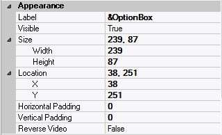
| Label | ??? | The label text which appears inside or along the top border of the form field;
A character in the label will be underlined if there is an ampersand (&) immediately before it. |
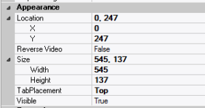
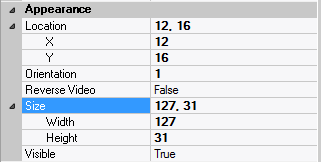
| Location | – | The location (in pixels) of this form field in relation to the top-left corner of its parent form or parent container. |
| X | – | The horizontal location of this form field. |
| Y | – | The vertical location of this form field. |
| Reverse Video | False | True → The text will appear in white on a black background;
False → The text will appear in black on a white background; |
| Size | – | The size of this form field in pixels. |
| Width | – | The width of this form field. |
| Height | – | The height of this form field. |
| Visible | True | True → This form field will be visible by default. |
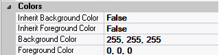
– Colors
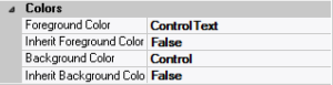
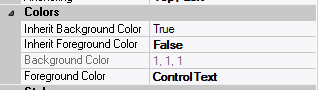
| Background Color | variable | The background color of the form field, container or user interface object in R(ed) G(reen) B(lue) values; |
| Foreground Color | variable | The foreground color of the form field, container or user interface object in R(ed) G(reen) B(lue) values. |
| Inherit Background Color | variable | True → The form field or container will inherit the background color of its parent container or parent form object. |
| Inherit Foreground Color | variable | True → The form field or container will inherit the foreground color of its parent container or parent form object. |
– Properties
| Availability | Available | The way in which the end-user will interact with this form field:
Available → This form field can receive input focus and its contents can be modified;
Unavailable → This form field cannot receive input focus and its contents cannot be modified;
Guarded → This form field can receive input focus but its contents cannot be modified;
Protected → This form field cannot receive input focus, its contents cannot be modified and it will appear grayed-out; |
| Tab Index | 0 | The relative position of this form field in the tab sequence order for its parent container or form field;
0 → The relative position of the form field in the structure chart will be used instead. |
| Tab Stop | True | True → This form field will be included in the tab order for its parent container or form;
False → |
| Z-Order | >= 10001 | The relative depth of this form field in relation to other form fields within the same parent container or form. |
– Style

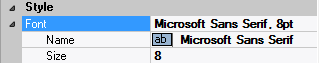
| Font | Microsoft Sans Serif, 8pt | The font in which text will be displayed inside this form field. |
| Name | Microsoft Sans Serif | The system name of the selected font. |
| Size | 8 | The size of the font in units. (Point is the default unit); |
| Bold | False | True → The text inside this form field will appear in bold. |
| Italic | False | True → The text inside this form field will appear in italic. |
| Strikeout | False | True → The text inside this form field will appear with a line across. |
| Underline | False | True → The text inside this form field will appear underlined. |
Main Characteristics of Tab Controls

A Tab Control mimics the behavior of dividers in a notebook, or labels in a file. By using a tab control, an application can define multiple pages for the same area within a window.
The tab control object is a container for tab pages. Once you have added a tab control to your project, you may proceed to add tab pages to the tab control.
Note: Unlike previous incarnations of the Zim tab control where one had to change the front to back order of frames to edit the individual tab pages, and where the programmer was required to add code to manage and manipulate the tab control, this is a true windows tab control object. To edit the individual tab pages, double click on the desired tab header. No coding is required for this tab control as it is managed by Windows.
The version of the tab control available in this development environment is only supported by Zim 8.50 (or higher) clients.
Tab Control Attributes
– Identification

| Field Type | – | The type of this form field or of this user interface object. (Read-only). |
| Field Name | variable | A string that identifies this form field within the Zim application;
Automatically assigned by the Zim IDE when a new form field is created;
May be changed by the developer, but must always conform to the Zim Object Naming Rules and satisfy the Zim Object Uniqueness Conditions. |
| Field Number | 0 | A number that may be used to identify this form field within the Zim application and in Callback Events;
May be changed by the developer and need not be unique;
Value must be an integer between 0 and 999; |
| Field Tag | “” | A string that may be used to identify this form field within the Zim application and in Callback Events;
May be changed by the developer and need not be unique;
If left blank, the Zim IDE will assign the value of Field Name to Field Tag. |
| Directory | ZIM | The directory that owns the parent form of this form field (Read-only). |
| Form Name | – | A string that identifies the parent form of this form field (Read-only). |
| Help Message | “” | A help message that will be displayed when this form field or this menu item receives input focus;
Displayed in the status bar of the window associated with the parent form of this form field (if the window object’s Status Bar attribute is set to True);
Displayed in a message field if one such field exists in the parent form of this form field. |
– Appearance

| Customized Pointer | default | The pointer (or cursor) style when the pointer is hovering over (or the cursor is inside) an available form field;
May be selected from the following choices in the list box:
Arrow → the standard arrow cursor;
Cross-hair → ;
I-Beam → ;
Icon → ;
Resize → ;
Size NE SW → ;
Size NS → ;
Size NW SE → ;
Size WE → ;
Up Arrow → ;
Hourglass → ;
default → The pointer style will be I-Beam for Entry Field and Arrow for all other form fields. |
| Label | ??? | The label text which appears inside or along the top border of the form field;
A character in the label will be underlined if there is an ampersand (&) immediately before it. |
| Location | – | The location (in pixels) of this form field in relation to the top-left corner of its parent form or parent container. |
| X | – | The horizontal location of this form field. |
| Y | – | The vertical location of this form field. |
| Reverse Video | False | True → The text will appear in white on a black background;
False → The text will appear in black on a white background; |
| Size | – | The size of this form field in pixels. |
| Width | – | The width of this form field. |
| Height | – | The height of this form field. |
| Visible | True | True → This form field will be visible by default. |
– Behavior
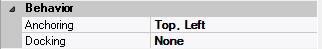
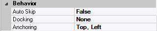
| Anchoring | Top, Left | When the window associated with this form field’s parent form is resized:
Top → The top edge of this form field will maintain its distance from the top edge of the window;
Bottom → The bottom edge of this form field will maintain its distance from the bottom edge of the window;
Left → The left edge of this form field will maintain its distance from the left edge of the window;
Right → The right edge of this form field will maintain its distance from the right edge of the window;
None → The same as Top, Left. |
| Docking | None | Top → The top edge of the form field will be expanded and placed;
Bottom → ;
Left → ;
Right → ;
Fill → ;
None → This form field. |
– Colors
| Background Color | variable | The background color of the form field, container or user interface object in R(ed) G(reen) B(lue) values; |
| Foreground Color | variable | The foreground color of the form field, container or user interface object in R(ed) G(reen) B(lue) values. |
| Inherit Background Color | variable | True → The form field or container will inherit the background color of its parent container or parent form object. |
| Inherit Foreground Color | variable | True → The form field or container will inherit the foreground color of its parent container or parent form object. |
– Properties
| Availability | Available | The way in which the end-user will interact with this form field:
Available → This form field can receive input focus and its contents can be modified;
Unavailable → This form field cannot receive input focus and its contents cannot be modified;
Guarded → This form field can receive input focus but its contents cannot be modified;
Protected → This form field cannot receive input focus, its contents cannot be modified and it will appear grayed-out; |
| Tab Index | 0 | The relative position of this form field in the tab sequence order for its parent container or form field;
0 → The relative position of the form field in the structure chart will be used instead. |
| Tab Stop | True | True → This form field will be included in the tab order for its parent container or form;
False → |
| Z-Order | >= 10001 | The relative depth of this form field in relation to other form fields within the same parent container or form. |
– Style

| Border Style | variable | None; Single Line; 3D; Beveled-In; Beveled-Out |
| Font | Microsoft Sans Serif, 8pt | The font in which text will be displayed inside this form field. |
| Name | Microsoft Sans Serif | The system name of the selected font. |
| Size | 8 | The size of the font in units. (Point is the default unit); |
| Bold | False | True → The text inside this form field will appear in bold. |
| Italic | False | True → The text inside this form field will appear in italic. |
| Strikeout | False | True → The text inside this form field will appear with a line across. |
| Underline | False | True → The text inside this form field will appear underlined. |
| Inherit Font | False | True → This form field will inherit all the Font attributes from its parent (form, frame or tab control). |
Main Characteristics of Option Boxes
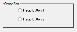
Option box form fields act as container objects for one or more option radio buttons or option image buttons. They provide a convenient mechanism for manipulating multiple option buttons as a group. An option box is assigned a specific data type and data length, and each option button which it owns inherits that data type and length. When a value is assigned to an option box is establishes the “On” state value for the option buttons which it owns. Those option buttons for which the value of the option box satisfies the validation rule for the option button or, if there is no validation rule, the default value for the option button, is displayed in the “On” state.
A typical way in which an option box containing option buttons is used is as follows. Each option button is assigned a default value from, for example, the list “Mr.”, “Mrs.”, “Ms.”, “Dr.” etc. When the option box is assigned the value “Ms.”, the option button with the default value of “Ms.” is displayed in the “On” state. All the other option buttons are displayed in the “Off” state. If the application end-user clicks on the option button with the default value of “Dr.”, the option box itself also assumes the value “Dr.”.
The option buttons owned by an option box inherit the colors, font, callback events and the availability attribute of the option box.
Option Box Attributes
– Identification
| Field Type | – | The type of this form field or of this user interface object. (Read-only). |
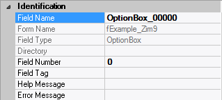
| Field Name | variable | A string that identifies this form field within the Zim application;
Automatically assigned by the Zim IDE when a new form field is created;
May be changed by the developer, but must always conform to the Zim Object Naming Rules and satisfy the Zim Object Uniqueness Conditions. |
| Field Number | 0 | A number that may be used to identify this form field within the Zim application and in Callback Events;
May be changed by the developer and need not be unique;
Value must be an integer between 0 and 999; |
| Field Tag | “” | A string that may be used to identify this form field within the Zim application and in Callback Events;
May be changed by the developer and need not be unique;
If left blank, the Zim IDE will assign the value of Field Name to Field Tag. |
| Directory | ZIM | The directory that owns the parent form of this form field (Read-only). |
| Form Name | – | A string that identifies the parent form of this form field (Read-only). |
| Help Message | “” | A help message that will be displayed when this form field or this menu item receives input focus;
Displayed in the status bar of the window associated with the parent form of this form field (if the window object’s Status Bar attribute is set to True);
Displayed in a message field if one such field exists in the parent form of this form field. |
– Appearance
| Customized Pointer | default | The pointer (or cursor) style when the pointer is hovering over (or the cursor is inside) an available form field;
May be selected from the following choices in the list box:
Arrow → the standard arrow cursor;
Cross-hair → ;
I-Beam → ;
Icon → ;
Resize → ;
Size NE SW → ;
Size NS → ;
Size NW SE → ;
Size WE → ;
Up Arrow → ;
Hourglass → ;
default → The pointer style will be I-Beam for Entry Field and Arrow for all other form fields. |
| Label | ??? | The label text which appears inside or along the top border of the form field;
A character in the label will be underlined if there is an ampersand (&) immediately before it. |
| Location | – | The location (in pixels) of this form field in relation to the top-left corner of its parent form or parent container. |
| X | – | The horizontal location of this form field. |
| Y | – | The vertical location of this form field. |
| Reverse Video | False | True → The text will appear in white on a black background;
False → The text will appear in black on a white background; |
| Size | – | The size of this form field in pixels. |
| Width | – | The width of this form field. |
| Height | – | The height of this form field. |
| Visible | True | True → This form field will be visible by default. |
– Behavior
| Anchoring | Top, Left | When the window associated with this form field’s parent form is resized:
Top → The top edge of this form field will maintain its distance from the top edge of the window;
Bottom → The bottom edge of this form field will maintain its distance from the bottom edge of the window;
Left → The left edge of this form field will maintain its distance from the left edge of the window;
Right → The right edge of this form field will maintain its distance from the right edge of the window;
None → The same as Top, Left. |
| Docking | None | Top → The top edge of the form field will be expanded and placed;
Bottom → ;
Left → ;
Right → ;
Fill → ;
None → This form field. |
– Callback Events
| All Callback Events | | When any of the following callback event attributes is set to True, this form field will be able to trigger the corresponding callback event;
After the event is triggered, the form input command will be terminated and the following values will populate the Event Vector:
Event.EventType = “FormField”;
Event.EventTag = the form field’s Field Tag attribute;
Additional values relative to specific callback events (see below);
Note:
Callback events can only be triggered by a form field if it is available and contained in a form that has input focus. |
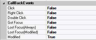
| Got Focus | False | Triggered when a mouse click, a tab key press or an accelerator key press causes this form field to acquire the input focus;
Event.EventName = “GotFocus” added to the Event Vector. |
| Lost Focus (Always) | False | Triggered when a mouse click, a tab key press or an accelerator key press causes this form field to lose the input focus;
Event.EventName = “LostFocus” added to the Event Vector. |
| Lost Focus (When Modified) | False | Triggered when a mouse click, a tab key press or an accelerator key press causes this form field to lose the input focus after its value has been modified (cf. Modified below);
Event.EventName = “LostFocusModified” added to the Event Vector. |
| Modified | False | Triggered when this option box undergoes a state change caused by a state change in one of the radio buttons it contains;
Event.EventName = “Modified” added to the Event Vector. |
– Colors
| Background Color | variable | The background color of the form field, container or user interface object in R(ed) G(reen) B(lue) values; |
| Foreground Color | variable | The foreground color of the form field, container or user interface object in R(ed) G(reen) B(lue) values. |
| Inherit Background Color | variable | True → The form field or container will inherit the background color of its parent container or parent form object. |
| Inherit Foreground Color | variable | True → The form field or container will inherit the foreground color of its parent container or parent form object. |
– Properties
| Availability | Available | The way in which the end-user will interact with this form field:
Available → This form field can receive input focus and its contents can be modified;
Unavailable → This form field cannot receive input focus and its contents cannot be modified;
Guarded → This form field can receive input focus but its contents cannot be modified;
Protected → This form field cannot receive input focus, its contents cannot be modified and it will appear grayed-out; |
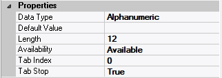
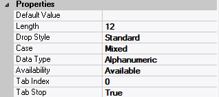
| Data Type | Alphanumeric | The data type of this form field:
Alphanumeric → May contain letters, digits and punctuation;
Non-Digit → May contain all characters except digits;
Numeric → May contain digits, decimal point, plus and minus signs;
Date → May contain digits according to the form specified in Input Mask; |
| Default Data Value | “” | The default data value of this form field. |
| Length | 12 | The length of the data displayed in this form field |
| Tab Index | 0 | The relative position of this form field in the tab sequence order for its parent container or form field;
0 → The relative position of the form field in the structure chart will be used instead. |
| Tab Stop | True | True → This form field will be included in the tab order for its parent container or form;
False → |
| Z-Order | >= 10001 | The relative depth of this form field in relation to other form fields within the same parent container or form. |
– Style

| Border Style | variable | None; Single Line; 3D; Beveled-In; Beveled-Out |
| Font | Microsoft Sans Serif, 8pt | The font in which text will be displayed inside this form field. |
| Name | Microsoft Sans Serif | The system name of the selected font. |
| Size | 8 | The size of the font in units. (Point is the default unit); |
| Bold | False | True → The text inside this form field will appear in bold. |
| Italic | False | True → The text inside this form field will appear in italic. |
| Strikeout | False | True → The text inside this form field will appear with a line across. |
| Underline | False | True → The text inside this form field will appear underlined. |
| Inherit Font | False | True → This form field will inherit all the Font attributes from its parent (form, frame or tab control). |
Main Characteristics of Frames
Frame form fields act as container objects for any number of any other type of form fields (including other frames). Frames do not have any associated data and hence have no assignable data type or length. The purpose of a frame is to assist in creating dialogs which have a pleasing appearance by organizing related form fields together.
The form fields owned by a frame inherit the colors, font and the availability attribute of the frame.
Frame Attributes
– Identification
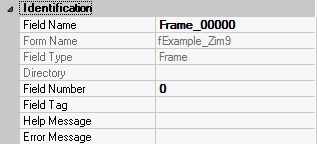
| Field Type | – | The type of this form field or of this user interface object. (Read-only). |
| Field Name | variable | A string that identifies this form field within the Zim application;
Automatically assigned by the Zim IDE when a new form field is created;
May be changed by the developer, but must always conform to the Zim Object Naming Rules and satisfy the Zim Object Uniqueness Conditions. |
| Field Number | 0 | A number that may be used to identify this form field within the Zim application and in Callback Events;
May be changed by the developer and need not be unique;
Value must be an integer between 0 and 999; |
| Field Tag | “” | A string that may be used to identify this form field within the Zim application and in Callback Events;
May be changed by the developer and need not be unique;
If left blank, the Zim IDE will assign the value of Field Name to Field Tag. |
| Directory | ZIM | The directory that owns the parent form of this form field (Read-only). |
| Form Name | – | A string that identifies the parent form of this form field (Read-only). |
| Help Message | “” | A help message that will be displayed when this form field or this menu item receives input focus;
Displayed in the status bar of the window associated with the parent form of this form field (if the window object’s Status Bar attribute is set to True);
Displayed in a message field if one such field exists in the parent form of this form field. |
– Appearance
| Customized Pointer | default | The pointer (or cursor) style when the pointer is hovering over (or the cursor is inside) an available form field;
May be selected from the following choices in the list box:
Arrow → the standard arrow cursor;
Cross-hair → ;
I-Beam → ;
Icon → ;
Resize → ;
Size NE SW → ;
Size NS → ;
Size NW SE → ;
Size WE → ;
Up Arrow → ;
Hourglass → ;
default → The pointer style will be I-Beam for Entry Field and Arrow for all other form fields. |
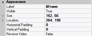
| Label | ??? | The label text which appears inside or along the top border of the form field;
A character in the label will be underlined if there is an ampersand (&) immediately before it. |
| Location | – | The location (in pixels) of this form field in relation to the top-left corner of its parent form or parent container. |
| X | – | The horizontal location of this form field. |
| Y | – | The vertical location of this form field. |
| Reverse Video | False | True → The text will appear in white on a black background;
False → The text will appear in black on a white background; |
| Size | – | The size of this form field in pixels. |
| Width | – | The width of this form field. |
| Height | – | The height of this form field. |
| Visible | True | True → This form field will be visible by default. |
– Behavior
| Anchoring | Top, Left | When the window associated with this form field’s parent form is resized:
Top → The top edge of this form field will maintain its distance from the top edge of the window;
Bottom → The bottom edge of this form field will maintain its distance from the bottom edge of the window;
Left → The left edge of this form field will maintain its distance from the left edge of the window;
Right → The right edge of this form field will maintain its distance from the right edge of the window;
None → The same as Top, Left. |
| Docking | None | Top → The top edge of the form field will be expanded and placed;
Bottom → ;
Left → ;
Right → ;
Fill → ;
None → This form field. |
– Colors
| Background Color | variable | The background color of the form field, container or user interface object in R(ed) G(reen) B(lue) values; |
| Foreground Color | variable | The foreground color of the form field, container or user interface object in R(ed) G(reen) B(lue) values. |
| Inherit Background Color | variable | True → The form field or container will inherit the background color of its parent container or parent form object. |
| Inherit Foreground Color | variable | True → The form field or container will inherit the foreground color of its parent container or parent form object. |
– Properties
| Availability | Available | The way in which the end-user will interact with this form field:
Available → This form field can receive input focus and its contents can be modified;
Unavailable → This form field cannot receive input focus and its contents cannot be modified;
Guarded → This form field can receive input focus but its contents cannot be modified;
Protected → This form field cannot receive input focus, its contents cannot be modified and it will appear grayed-out; |
| Tab Index | 0 | The relative position of this form field in the tab sequence order for its parent container or form field;
0 → The relative position of the form field in the structure chart will be used instead. |
| Tab Stop | True | True → This form field will be included in the tab order for its parent container or form;
False → |
| Z-Order | >= 10001 | The relative depth of this form field in relation to other form fields within the same parent container or form. |
– Style
| Border Style | variable | None; Single Line; 3D; Beveled-In; Beveled-Out |
| Font | Microsoft Sans Serif, 8pt | The font in which text will be displayed inside this form field. |
| Name | Microsoft Sans Serif | The system name of the selected font. |
| Size | 8 | The size of the font in units. (Point is the default unit); |
| Bold | False | True → The text inside this form field will appear in bold. |
| Italic | False | True → The text inside this form field will appear in italic. |
| Strikeout | False | True → The text inside this form field will appear with a line across. |
| Underline | False | True → The text inside this form field will appear underlined. |
| Inherit Font | False | True → This form field will inherit all the Font attributes from its parent (form, frame or tab control). |
Main Characteristics of Scroll Bars
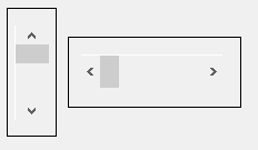
Scroll bars form fields have a variety of uses. They are commonly used for providing the application end-user with a convenient mechanism for scrolling over more data than fits on the screen, but they can be used for other purposes as well. The data type for a scroll bar is always numeric. The values that an activated scroll bar delivers (or can be assigned) is a function of a numeric scale, and a small and large increment within that scale.
| Scale | The scale associated with a scroll bar is defined by a minimum and a maximum value. For a vertical scroll bar, these values correspond to the scroll bar’s “bar” being positioned at the top and bottom respectively, within the scroll bar’s “trough”. For a horizontal scroll bar, read far left for top and far right for bottom. |
| Small Increment | The small increment associated with a vertical scroll bar is that amount that is added to (or subtracted from), the current value of the scroll bar when the application end-user clicks on the top (or bottom) arrow. For a horizontal scroll bar, read left arrow for top arrow, and right arrow for bottom arrow. |
| Large Increment | The large increment associated with a vertical scroll bar is that amount that is added to (or subtracted from), the current value of the scroll bar when the application end-user clicks within the top (or bottom) portion of the “trough”. For a horizontal scroll bar, read left for top and right for bottom. |
Scroll Bars Attributes
– Identification

| Field Type | – | The type of this form field or of this user interface object. (Read-only). |
| Field Name | variable | A string that identifies this form field within the Zim application;
Automatically assigned by the Zim IDE when a new form field is created;
May be changed by the developer, but must always conform to the Zim Object Naming Rules and satisfy the Zim Object Uniqueness Conditions. |
| Field Number | 0 | A number that may be used to identify this form field within the Zim application and in Callback Events;
May be changed by the developer and need not be unique;
Value must be an integer between 0 and 999; |
| Field Tag | “” | A string that may be used to identify this form field within the Zim application and in Callback Events;
May be changed by the developer and need not be unique;
If left blank, the Zim IDE will assign the value of Field Name to Field Tag. |
| Directory | ZIM | The directory that owns the parent form of this form field (Read-only). |
| Form Name | – | A string that identifies the parent form of this form field (Read-only). |
| Help Message | “” | A help message that will be displayed when this form field or this menu item receives input focus;
Displayed in the status bar of the window associated with the parent form of this form field (if the window object’s Status Bar attribute is set to True);
Displayed in a message field if one such field exists in the parent form of this form field. |
– Appearance
| Customized Pointer | default | The pointer (or cursor) style when the pointer is hovering over (or the cursor is inside) an available form field;
May be selected from the following choices in the list box:
Arrow → the standard arrow cursor;
Cross-hair → ;
I-Beam → ;
Icon → ;
Resize → ;
Size NE SW → ;
Size NS → ;
Size NW SE → ;
Size WE → ;
Up Arrow → ;
Hourglass → ;
default → The pointer style will be I-Beam for Entry Field and Arrow for all other form fields. |
| Location | – | The location (in pixels) of this form field in relation to the top-left corner of its parent form or parent container. |
| X | – | The horizontal location of this form field. |
| Y | – | The vertical location of this form field. |
| Orientation | – | 1 → This is a horizontal scroll bar;
2 → This is a vertical scroll bar. |
| Size | – | The size of this form field in pixels. |
| Width | – | The width of this form field. |
| Height | – | The height of this form field. |
| Visible | True | True → This form field will be visible by default. |
– Behavior
| Anchoring | Top, Left | When the window associated with this form field’s parent form is resized:
Top → The top edge of this form field will maintain its distance from the top edge of the window;
Bottom → The bottom edge of this form field will maintain its distance from the bottom edge of the window;
Left → The left edge of this form field will maintain its distance from the left edge of the window;
Right → The right edge of this form field will maintain its distance from the right edge of the window;
None → The same as Top, Left. |
| Auto Skip | False | True → The input focus will automatically skip to the next available form field after the value or state of this form field has been modified. |
| Docking | None | Top → The top edge of the form field will be expanded and placed;
Bottom → ;
Left → ;
Right → ;
Fill → ;
None → This form field. |
– Callback Events
| All Callback Events | | When any of the following callback event attributes is set to True, this form field will be able to trigger the corresponding callback event;
After the event is triggered, the form input command will be terminated and the following values will populate the Event Vector:
Event.EventType = “FormField”;
Event.EventTag = the form field’s Field Tag attribute;
Additional values relative to specific callback events (see below);
Note:
Callback events can only be triggered by a form field if it is available and contained in a form that has input focus. |
| Click | False | Triggered when the left mouse button is clicked within this form field;
Event.EventName = “Click” added to the Event Vector. |
| Got Focus | False | Triggered when a mouse click, a tab key press or an accelerator key press causes this form field to acquire the input focus;
Event.EventName = “GotFocus” added to the Event Vector. |
| Lost Focus (Always) | False | Triggered when a mouse click, a tab key press or an accelerator key press causes this form field to lose the input focus;
Event.EventName = “LostFocus” added to the Event Vector. |
| Lost Focus (When Modified) | False | Triggered when a mouse click, a tab key press or an accelerator key press causes this form field to lose the input focus after its value has been modified (cf. Modified below);
Event.EventName = “LostFocusModified” added to the Event Vector. |
| Modified | False | Triggered when the value or state of this form field is modified by a left mouse button click;
Event.EventName = “Modified” added to Event Vector. |
| Right Click | False | Triggered when the right mouse button is clicked on or inside this form field;
Event.EventName = “RightClick” added to the Event Vector. |
– Colors

| Inherit Background Color | variable | True → The form field or container will inherit the background color of its parent container or parent form object. |
| Inherit Foreground Color | variable | True → The form field or container will inherit the foreground color of its parent container or parent form object. |
– Properties

| Availability | Available | The way in which the end-user will interact with this form field:
Available → This form field can receive input focus and its contents can be modified;
Unavailable → This form field cannot receive input focus and its contents cannot be modified;
Guarded → This form field can receive input focus but its contents cannot be modified;
Protected → This form field cannot receive input focus, its contents cannot be modified and it will appear grayed-out; |
| Default Data Value | “” | The default data value of this form field. |
| Minimum Value | 0 | The scroll bar data value when the bar is at the leftmost or rightmost position; |
| Maximum Value | 100 | The scroll bar data value when the bar is at the topmost or bottommost position; |
| Small Increment | 1 | The value that will be added to, or subtracted from, this scroll bar’s value when one of the arrows is clicked. |
| Large Increment | 10 | The value that will be added to, or subtracted from, this scroll bar’s value when one of the trough areas is clicked. |
| Tab Index | 0 | The relative position of this form field in the tab sequence order for its parent container or form field;
0 → The relative position of the form field in the structure chart will be used instead. |
| Tab Stop | True | True → This form field will be included in the tab order for its parent container or form;
False → |
| Z-Order | >= 10001 | The relative depth of this form field in relation to other form fields within the same parent container or form. |
Main Characteristics of Radio Buttons
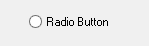
Radio button form fields belong to the generic classes of form field called “Toggle Buttons” if owned by an object other than an option box form field, or “Option Buttons” if owned by an option box form field. They are most commonly used for supporting On/Off or True/False type data values, although they are not restricted to these value types. Multiple radio buttons owned by the same parent object cannot be in the “On” state simultaneously.
Radio buttons can be text-based or image-based. Text radio buttons are displayed as the familiar “circle” immediately followed by some descriptive text. The value state of a text radio button is “On” if the circle portion contains another solid circle and “Off” if no solid circle is present. Image radio buttons are displayed as an image with no associated text or circle portion. The value state of an image radio button (more appropriately, “image toggle button” or “image option button”) is determined by which one of the two possible images is displayed. The physical dimensions of an image radio button are controlled by the selected automatic sizing option.
Radio Button Attributes
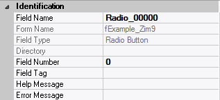
– Identification
| Field Type | – | The type of this form field or of this user interface object. (Read-only). |
| Field Name | variable | A string that identifies this form field within the Zim application;
Automatically assigned by the Zim IDE when a new form field is created;
May be changed by the developer, but must always conform to the Zim Object Naming Rules and satisfy the Zim Object Uniqueness Conditions. |
| Field Number | 0 | A number that may be used to identify this form field within the Zim application and in Callback Events;
May be changed by the developer and need not be unique;
Value must be an integer between 0 and 999; |
| Field Tag | “” | A string that may be used to identify this form field within the Zim application and in Callback Events;
May be changed by the developer and need not be unique;
If left blank, the Zim IDE will assign the value of Field Name to Field Tag. |
| Directory | ZIM | The directory that owns the parent form of this form field (Read-only). |
| Form Name | – | A string that identifies the parent form of this form field (Read-only). |
| Help Message | “” | A help message that will be displayed when this form field or this menu item receives input focus;
Displayed in the status bar of the window associated with the parent form of this form field (if the window object’s Status Bar attribute is set to True);
Displayed in a message field if one such field exists in the parent form of this form field. |
– Appearance
| Customized Pointer | default | The pointer (or cursor) style when the pointer is hovering over (or the cursor is inside) an available form field;
May be selected from the following choices in the list box:
Arrow → the standard arrow cursor;
Cross-hair → ;
I-Beam → ;
Icon → ;
Resize → ;
Size NE SW → ;
Size NS → ;
Size NW SE → ;
Size WE → ;
Up Arrow → ;
Hourglass → ;
default → The pointer style will be I-Beam for Entry Field and Arrow for all other form fields. |
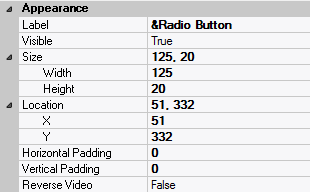
| Label | ??? | The label text which appears inside or along the top border of the form field;
A character in the label will be underlined if there is an ampersand (&) immediately before it. |
| Location | – | The location (in pixels) of this form field in relation to the top-left corner of its parent form or parent container. |
| X | – | The horizontal location of this form field. |
| Y | – | The vertical location of this form field. |
| Reverse Video | False | True → The text will appear in white on a black background;
False → The text will appear in black on a white background; |
| Size | – | The size of this form field in pixels. |
| Width | – | The width of this form field. |
| Height | – | The height of this form field. |
| Visible | True | True → This form field will be visible by default. |
– Behavior
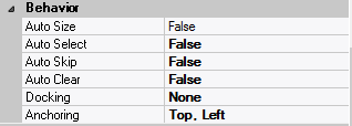
| Anchoring | Top, Left | When the window associated with this form field’s parent form is resized:
Top → The top edge of this form field will maintain its distance from the top edge of the window;
Bottom → The bottom edge of this form field will maintain its distance from the bottom edge of the window;
Left → The left edge of this form field will maintain its distance from the left edge of the window;
Right → The right edge of this form field will maintain its distance from the right edge of the window;
None → The same as Top, Left. |
| Auto Select | False | True → The contents or state of this form field will be automatically highlighted when it receives input focus. |
| Auto Skip | False | True → The input focus will automatically skip to the next available form field after the value or state of this form field has been modified. |
| Docking | None | Top → The top edge of the form field will be expanded and placed;
Bottom → ;
Left → ;
Right → ;
Fill → ;
None → This form field. |
– Callback Events
| All Callback Events | | When any of the following callback event attributes is set to True, this form field will be able to trigger the corresponding callback event;
After the event is triggered, the form input command will be terminated and the following values will populate the Event Vector:
Event.EventType = “FormField”;
Event.EventTag = the form field’s Field Tag attribute;
Additional values relative to specific callback events (see below);
Note:
Callback events can only be triggered by a form field if it is available and contained in a form that has input focus. |
| Click | False | Triggered when the left mouse button is clicked within this form field;
Event.EventName = “Click” added to the Event Vector. |
| Got Focus | False | Triggered when a mouse click, a tab key press or an accelerator key press causes this form field to acquire the input focus;
Event.EventName = “GotFocus” added to the Event Vector. |
| Lost Focus (Always) | False | Triggered when a mouse click, a tab key press or an accelerator key press causes this form field to lose the input focus;
Event.EventName = “LostFocus” added to the Event Vector. |
| Lost Focus (When Modified) | False | Triggered when a mouse click, a tab key press or an accelerator key press causes this form field to lose the input focus after its value has been modified (cf. Modified below);
Event.EventName = “LostFocusModified” added to the Event Vector. |
| Modified | False | Triggered when the value or state of this form field is modified by a left mouse button click;
Event.EventName = “Modified” added to Event Vector. |
| Right Click | False | Triggered when the right mouse button is clicked on or inside this form field;
Event.EventName = “RightClick” added to the Event Vector. |
– Colors
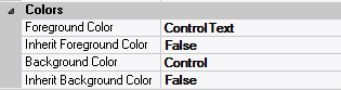
| Background Color | variable | The background color of the form field, container or user interface object in R(ed) G(reen) B(lue) values; |
| Foreground Color | variable | The foreground color of the form field, container or user interface object in R(ed) G(reen) B(lue) values. |
| Inherit Background Color | variable | True → The form field or container will inherit the background color of its parent container or parent form object. |
| Inherit Foreground Color | variable | True → The form field or container will inherit the foreground color of its parent container or parent form object. |
– Properties
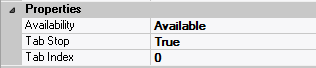
| Availability | Available | The way in which the end-user will interact with this form field:
Available → This form field can receive input focus and its contents can be modified;
Unavailable → This form field cannot receive input focus and its contents cannot be modified;
Guarded → This form field can receive input focus but its contents cannot be modified;
Protected → This form field cannot receive input focus, its contents cannot be modified and it will appear grayed-out; |
| Off-State Value | 0 | The data value when this form field is in the Off state; |
| On-State Value | 1 | The data value when this form field is in the On state; |
| On-State Validation Rule | 1 | The data validation rule that defines a legal value for this form field in the On state; |
| Tab Index | 0 | The relative position of this form field in the tab sequence order for its parent container or form field;
0 → The relative position of the form field in the structure chart will be used instead. |
| Tab Stop | True | True → This form field will be included in the tab order for its parent container or form;
False → |
| Z-Order | >= 10001 | The relative depth of this form field in relation to other form fields within the same parent container or form. |
– Style
| Font | Microsoft Sans Serif, 8pt | The font in which text will be displayed inside this form field. |
| Name | Microsoft Sans Serif | The system name of the selected font. |
| Size | 8 | The size of the font in units. (Point is the default unit); |
| Bold | False | True → The text inside this form field will appear in bold. |
| Italic | False | True → The text inside this form field will appear in italic. |
| Strikeout | False | True → The text inside this form field will appear with a line across. |
| Underline | False | True → The text inside this form field will appear underlined. |
| Inherit Font | False | True → This form field will inherit all the Font attributes from its parent (form, frame or tab control). |
Main Characteristics of Push Buttons

Push button form fields are most commonly used for implementing application execution control. Push buttons have no associated data and by default, are assigned to respond to the “Click” callback event. Push buttons can be either text-based or image-based. A text push button appears as the familiar raised gray “bar” with superimposed text. The physical dimensions of a text push button can be changed as required. An image push button appears as the familiar raised gray bar with a superimposed image which can be a bit map, an icon or Windows meta file. The physical dimensions of an image push button are controlled by the selected automatic sizing option. A push button can also be defined as being the “default push button”. The default push button is the one which is considered to have been selected if the Enter key is pressed, and is displayed with a thicker border than the other push buttons.
Push Button Attributes
– Identification
| Field Type | – | The type of this form field or of this user interface object. (Read-only). |
| Field Name | variable | A string that identifies this form field within the Zim application;
Automatically assigned by the Zim IDE when a new form field is created;
May be changed by the developer, but must always conform to the Zim Object Naming Rules and satisfy the Zim Object Uniqueness Conditions. |
| Field Number | 0 | A number that may be used to identify this form field within the Zim application and in Callback Events;
May be changed by the developer and need not be unique;
Value must be an integer between 0 and 999; |
| Field Tag | “” | A string that may be used to identify this form field within the Zim application and in Callback Events;
May be changed by the developer and need not be unique;
If left blank, the Zim IDE will assign the value of Field Name to Field Tag. |
| Directory | ZIM | The directory that owns the parent form of this form field (Read-only). |
| Form Name | – | A string that identifies the parent form of this form field (Read-only). |
| Help Message | “” | A help message that will be displayed when this form field or this menu item receives input focus;
Displayed in the status bar of the window associated with the parent form of this form field (if the window object’s Status Bar attribute is set to True);
Displayed in a message field if one such field exists in the parent form of this form field. |
– Appearance

| Customized Pointer | default | The pointer (or cursor) style when the pointer is hovering over (or the cursor is inside) an available form field;
May be selected from the following choices in the list box:
Arrow → the standard arrow cursor;
Cross-hair → ;
I-Beam → ;
Icon → ;
Resize → ;
Size NE SW → ;
Size NS → ;
Size NW SE → ;
Size WE → ;
Up Arrow → ;
Hourglass → ;
default → The pointer style will be I-Beam for Entry Field and Arrow for all other form fields. |
| Label | ??? | The label text which appears inside or along the top border of the form field;
A character in the label will be underlined if there is an ampersand (&) immediately before it. |
| Location | – | The location (in pixels) of this form field in relation to the top-left corner of its parent form or parent container. |
| X | – | The horizontal location of this form field. |
| Y | – | The vertical location of this form field. |
| Reverse Video | False | True → The text will appear in white on a black background;
False → The text will appear in black on a white background; |
| Size | – | The size of this form field in pixels. |
| Width | – | The width of this form field. |
| Height | – | The height of this form field. |
| Visible | True | True → This form field will be visible by default. |
– Behavior

| Anchoring | Top, Left | When the window associated with this form field’s parent form is resized:
Top → The top edge of this form field will maintain its distance from the top edge of the window;
Bottom → The bottom edge of this form field will maintain its distance from the bottom edge of the window;
Left → The left edge of this form field will maintain its distance from the left edge of the window;
Right → The right edge of this form field will maintain its distance from the right edge of the window;
None → The same as Top, Left. |
| Auto Size | None-Clipped | None-Clipped → The image in this form field object will be displayed in its original size anchored at the top-left corner of the object. If the image is wider or taller than the object, it will be clipped horizontally or vertically to fit within the object;
Image to Object → The image will occupy the entire area of the object but its aspect ratio will not be preserved;
Image Proportional → The image will be scaled and centered within the object and its aspect ratio will be preserved;
Object to Image → The object will be scaled to fit the image in its original size. The object cannot be resized. |
| Auto Skip | False | True → The input focus will automatically skip to the next available form field after the value or state of this form field has been modified. |
| Docking | None | Top → The top edge of the form field will be expanded and placed;
Bottom → ;
Left → ;
Right → ;
Fill → ;
None → This form field. |
– Callback Events

| All Callback Events | | When any of the following callback event attributes is set to True, this form field will be able to trigger the corresponding callback event;
After the event is triggered, the form input command will be terminated and the following values will populate the Event Vector:
Event.EventType = “FormField”;
Event.EventTag = the form field’s Field Tag attribute;
Additional values relative to specific callback events (see below);
Note:
Callback events can only be triggered by a form field if it is available and contained in a form that has input focus. |
| Click | False | Triggered when the left mouse button is clicked within this form field;
Event.EventName = “Click” added to the Event Vector. |
| Got Focus | False | Triggered when a mouse click, a tab key press or an accelerator key press causes this form field to acquire the input focus;
Event.EventName = “GotFocus” added to the Event Vector. |
| Lost Focus (Always) | False | Triggered when a mouse click, a tab key press or an accelerator key press causes this form field to lose the input focus;
Event.EventName = “LostFocus” added to the Event Vector. |
| Right Click | False | Triggered when the right mouse button is clicked on or inside this form field;
Event.EventName = “RightClick” added to the Event Vector. |
– Properties
| Availability | Available | The way in which the end-user will interact with this form field:
Available → This form field can receive input focus and its contents can be modified;
Unavailable → This form field cannot receive input focus and its contents cannot be modified;
Guarded → This form field can receive input focus but its contents cannot be modified;
Protected → This form field cannot receive input focus, its contents cannot be modified and it will appear grayed-out; |
| Default Button | False | True → Pressing the <enter> key will cause this push button to be pressed;
This push button will also be displayed with a thicker border than the border of all other button on this form. |
| Tab Index | 0 | The relative position of this form field in the tab sequence order for its parent container or form field;
0 → The relative position of the form field in the structure chart will be used instead. |
| Tab Stop | True | True → This form field will be included in the tab order for its parent container or form;
False → |
| Z-Order | >= 10001 | The relative depth of this form field in relation to other form fields within the same parent container or form. |
– Style

| Button Type | Text | Image → This push button will contain only an image determined by the Image File attribute;
Text → This push button will contain only a text label determined by the Label attribute;
Image & Text → This push button will both a text label and an image. |
| Font | Microsoft Sans Serif, 8pt | The font in which text will be displayed inside this form field. |
| Name | Microsoft Sans Serif | The system name of the selected font. |
| Size | 8 | The size of the font in units. (Point is the default unit); |
| Bold | False | True → The text inside this form field will appear in bold. |
| Italic | False | True → The text inside this form field will appear in italic. |
| Strikeout | False | True → The text inside this form field will appear with a line across. |
| Underline | False | True → The text inside this form field will appear underlined. |
| Image File | “” | The image file that will be displayed inside this push button;
Selected by clicking  and browsing the file system; and browsing the file system;
Note: This attribute is only available when Button Type = Image or Button Type = Image & Text. |
| Image Type | “” | The type of image that will be displayed within this push button (Read-only). |
| Inherit Font | False | True → This form field will inherit all the Font attributes from its parent (form, frame or tab control). |
Main Characteristics of Pictures
Image form fields are used for displaying pictures.
Supported file formats are: .bmp, ico, .wmf, and .jpg.
Picture Attributes
– Identification
| Field Type | – | The type of this form field or of this user interface object. (Read-only). |
| Field Name | variable | A string that identifies this form field within the Zim application;
Automatically assigned by the Zim IDE when a new form field is created;
May be changed by the developer, but must always conform to the Zim Object Naming Rules and satisfy the Zim Object Uniqueness Conditions. |
| Field Number | 0 | A number that may be used to identify this form field within the Zim application and in Callback Events;
May be changed by the developer and need not be unique;
Value must be an integer between 0 and 999; |
| Field Tag | “” | A string that may be used to identify this form field within the Zim application and in Callback Events;
May be changed by the developer and need not be unique;
If left blank, the Zim IDE will assign the value of Field Name to Field Tag. |
| Directory | ZIM | The directory that owns the parent form of this form field (Read-only). |
| Form Name | – | A string that identifies the parent form of this form field (Read-only). |
| Help Message | “” | A help message that will be displayed when this form field or this menu item receives input focus;
Displayed in the status bar of the window associated with the parent form of this form field (if the window object’s Status Bar attribute is set to True);
Displayed in a message field if one such field exists in the parent form of this form field. |
– Appearance
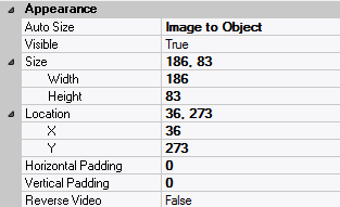
| Location | – | The location (in pixels) of this form field in relation to the top-left corner of its parent form or parent container. |
| X | – | The horizontal location of this form field. |
| Y | – | The vertical location of this form field. |
| Reverse Video | False | True → The text will appear in white on a black background;
False → The text will appear in black on a white background; |
| Size | – | The size of this form field in pixels. |
| Width | – | The width of this form field. |
| Height | – | The height of this form field. |
| Visible | True | True → This form field will be visible by default. |
– Behavior
| Auto Size | None-Clipped | None-Clipped → The image in this form field object will be displayed in its original size anchored at the top-left corner of the object. If the image is wider or taller than the object, it will be clipped horizontally or vertically to fit within the object;
Image to Object → The image will occupy the entire area of the object but its aspect ratio will not be preserved;
Image Proportional → The image will be scaled and centered within the object and its aspect ratio will be preserved;
Object to Image → The object will be scaled to fit the image in its original size. The object cannot be resized. |
– Calback Events

| All Callback Events | | When any of the following callback event attributes is set to True, this form field will be able to trigger the corresponding callback event;
After the event is triggered, the form input command will be terminated and the following values will populate the Event Vector:
Event.EventType = “FormField”;
Event.EventTag = the form field’s Field Tag attribute;
Additional values relative to specific callback events (see below);
Note:
Callback events can only be triggered by a form field if it is available and contained in a form that has input focus. |
| Click | False | Triggered when the left mouse button is clicked within this form field;
Event.EventName = “Click” added to the Event Vector. |
| Double Click | False | Triggered when the left mouse button is double-clicked within this form field;
Event.EventName = “DoubleClick” added to the Event Vector. |
| Got Focus | False | Triggered when a mouse click, a tab key press or an accelerator key press causes this form field to acquire the input focus;
Event.EventName = “GotFocus” added to the Event Vector. |
| Lost Focus (Always) | False | Triggered when a mouse click, a tab key press or an accelerator key press causes this form field to lose the input focus;
Event.EventName = “LostFocus” added to the Event Vector. |
| Right Click | False | Triggered when the right mouse button is clicked on or inside this form field;
Event.EventName = “RightClick” added to the Event Vector. |
– Properties
| Availability | Available | The way in which the end-user will interact with this form field:
Available → This form field can receive input focus and its contents can be modified;
Unavailable → This form field cannot receive input focus and its contents cannot be modified;
Guarded → This form field can receive input focus but its contents cannot be modified;
Protected → This form field cannot receive input focus, its contents cannot be modified and it will appear grayed-out; |
| Tab Index | 0 | The relative position of this form field in the tab sequence order for its parent container or form field;
0 → The relative position of the form field in the structure chart will be used instead. |
| Tab Stop | True | True → This form field will be included in the tab order for its parent container or form;
False → |
| Z-Order | >= 10001 | The relative depth of this form field in relation to other form fields within the same parent container or form. |
– Style
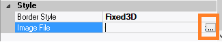
| Border Style | variable | None; Single Line; 3D; Beveled-In; Beveled-Out |
| Image File | “” | The image file that will be displayed inside this push button;
Selected by clicking and browsing the file system;
Note: This attribute is only available when Button Type = Image or Button Type = Image & Text. |


 English
  Portuguese