
The Push Button
Main Characteristics of Push Buttons

Push button form fields are most commonly used for implementing application execution control. Push buttons have no associated data and by default, are assigned to respond to the “Click” callback event. Push buttons can be either text-based or image-based. A text push button appears as the familiar raised gray “bar” with superimposed text. The physical dimensions of a text push button can be changed as required. An image push button appears as the familiar raised gray bar with a superimposed image which can be a bit map, an icon or Windows meta file. The physical dimensions of an image push button are controlled by the selected automatic sizing option. A push button can also be defined as being the “default push button”. The default push button is the one which is considered to have been selected if the Enter key is pressed, and is displayed with a thicker border than the other push buttons.
Push Button Attributes
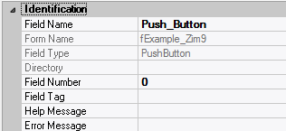
– Identification
| Attribute Name | Default Value | Description |
| Field Type | – | The type of this form field or of this user interface object. (Read-only). |
| Field Name | variable | A string that identifies this form field within the Zim application; Automatically assigned by the Zim IDE when a new form field is created; May be changed by the developer, but must always conform to the Zim Object Naming Rules and satisfy the Zim Object Uniqueness Conditions. |
| Field Number | 0 | A number that may be used to identify this form field within the Zim application and in Callback Events; May be changed by the developer and need not be unique; Value must be an integer between 0 and 999; |
| Field Tag | “” | A string that may be used to identify this form field within the Zim application and in Callback Events; May be changed by the developer and need not be unique; If left blank, the Zim IDE will assign the value of Field Name to Field Tag. |
| Directory | ZIM | The directory that owns the parent form of this form field (Read-only). |
| Form Name | – | A string that identifies the parent form of this form field (Read-only). |
| Help Message | “” | A help message that will be displayed when this form field or this menu item receives input focus; Displayed in the status bar of the window associated with the parent form of this form field (if the window object’s Status Bar attribute is set to True); Displayed in a message field if one such field exists in the parent form of this form field. |
– Appearance

| Attribute Name | Default Value | Description |
| Customized Pointer | default | The pointer (or cursor) style when the pointer is hovering over (or the cursor is inside) an available form field; May be selected from the following choices in the list box: Arrow → the standard arrow cursor; Cross-hair → ; I-Beam → ; Icon → ; Resize → ; Size NE SW → ; Size NS → ; Size NW SE → ; Size WE → ; Up Arrow → ; Hourglass → ; default → The pointer style will be I-Beam for Entry Field and Arrow for all other form fields. |
| Label | ??? | The label text which appears inside or along the top border of the form field; A character in the label will be underlined if there is an ampersand (&) immediately before it. |
| Location | – | The location (in pixels) of this form field in relation to the top-left corner of its parent form or parent container. |
| X | – | The horizontal location of this form field. |
| Y | – | The vertical location of this form field. |
| Reverse Video | False | True → The text will appear in white on a black background; False → The text will appear in black on a white background; |
| Size | – | The size of this form field in pixels. |
| Width | – | The width of this form field. |
| Height | – | The height of this form field. |
| Visible | True | True → This form field will be visible by default. |
– Behavior

| Attribute Name | Default Value | Description |
| Anchoring | Top, Left | When the window associated with this form field’s parent form is resized: Top → The top edge of this form field will maintain its distance from the top edge of the window; Bottom → The bottom edge of this form field will maintain its distance from the bottom edge of the window; Left → The left edge of this form field will maintain its distance from the left edge of the window; Right → The right edge of this form field will maintain its distance from the right edge of the window; None → The same as Top, Left. |
| Auto Size | None-Clipped | None-Clipped → The image in this form field object will be displayed in its original size anchored at the top-left corner of the object. If the image is wider or taller than the object, it will be clipped horizontally or vertically to fit within the object; Image to Object → The image will occupy the entire area of the object but its aspect ratio will not be preserved; Image Proportional → The image will be scaled and centered within the object and its aspect ratio will be preserved; Object to Image → The object will be scaled to fit the image in its original size. The object cannot be resized. |
| Auto Skip | False | True → The input focus will automatically skip to the next available form field after the value or state of this form field has been modified. |
| Docking | None | Top → The top edge of the form field will be expanded and placed; Bottom → ; Left → ; Right → ; Fill → ; None → This form field. |
– Callback Events

| Attribute Name | Default Value | Description |
| All Callback Events | When any of the following callback event attributes is set to True, this form field will be able to trigger the corresponding callback event; After the event is triggered, the form input command will be terminated and the following values will populate the Event Vector: Event.EventType = “FormField”; Event.EventTag = the form field’s Field Tag attribute; Additional values relative to specific callback events (see below); Note: Callback events can only be triggered by a form field if it is available and contained in a form that has input focus. | |
| Click | False | Triggered when the left mouse button is clicked within this form field; Event.EventName = “Click” added to the Event Vector. |
| Got Focus | False | Triggered when a mouse click, a tab key press or an accelerator key press causes this form field to acquire the input focus; Event.EventName = “GotFocus” added to the Event Vector. |
| Lost Focus (Always) | False | Triggered when a mouse click, a tab key press or an accelerator key press causes this form field to lose the input focus; Event.EventName = “LostFocus” added to the Event Vector. |
| Right Click | False | Triggered when the right mouse button is clicked on or inside this form field; Event.EventName = “RightClick” added to the Event Vector. |
– Properties
| Attribute Name | Default Value | Description |
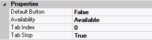
| Availability | Available | The way in which the end-user will interact with this form field: Available → This form field can receive input focus and its contents can be modified; Unavailable → This form field cannot receive input focus and its contents cannot be modified; Guarded → This form field can receive input focus but its contents cannot be modified; Protected → This form field cannot receive input focus, its contents cannot be modified and it will appear grayed-out; |
| Default Button | False | True → Pressing the <enter> key will cause this push button to be pressed; This push button will also be displayed with a thicker border than the border of all other button on this form. |
| Tab Index | 0 | The relative position of this form field in the tab sequence order for its parent container or form field; 0 → The relative position of the form field in the structure chart will be used instead. |
| Tab Stop | True | True → This form field will be included in the tab order for its parent container or form; False → |
| Z-Order | >= 10001 | The relative depth of this form field in relation to other form fields within the same parent container or form. |
– Style

| Attribute Name | Default Value | Description |
| Button Type | Text | Image → This push button will contain only an image determined by the Image File attribute; Text → This push button will contain only a text label determined by the Label attribute; Image & Text → This push button will both a text label and an image. |
| Font | Microsoft Sans Serif, 8pt | The font in which text will be displayed inside this form field. |
| Name | Microsoft Sans Serif | The system name of the selected font. |
| Size | 8 | The size of the font in units. (Point is the default unit); |
| Bold | False | True → The text inside this form field will appear in bold. |
| Italic | False | True → The text inside this form field will appear in italic. |
| Strikeout | False | True → The text inside this form field will appear with a line across. |
| Underline | False | True → The text inside this form field will appear underlined. |
| Image File | “” | The image file that will be displayed inside this push button; Selected by clicking  and browsing the file system; and browsing the file system;Note: This attribute is only available when Button Type = Image or Button Type = Image & Text. |
| Image Type | “” | The type of image that will be displayed within this push button (Read-only). |
| Inherit Font | False | True → This form field will inherit all the Font attributes from its parent (form, frame or tab control). |
 English
  Portuguese