
How Can We Help?
The Tab Page
Main Characteristics of Tab Pages

Adds a single tab page to the tab control container.
Tab Page Attributes
– Identification

| Attribute Name | Default Value | Description |
| Field Type | – | The type of this form field or of this user interface object. (Read-only). |
| Field Name | variable | A string that identifies this form field within the Zim application; Automatically assigned by the Zim IDE when a new form field is created; May be changed by the developer, but must always conform to the Zim Object Naming Rules and satisfy the Zim Object Uniqueness Conditions. |
| Field Number | 0 | A number that may be used to identify this form field within the Zim application and in Callback Events; May be changed by the developer and need not be unique; Value must be an integer between 0 and 999; |
| Field Tag | “” | A string that may be used to identify this form field within the Zim application and in Callback Events; May be changed by the developer and need not be unique; If left blank, the Zim IDE will assign the value of Field Name to Field Tag. |
| Directory | ZIM | The directory that owns the parent form of this form field (Read-only). |
| Form Name | – | A string that identifies the parent form of this form field (Read-only). |
| Help Message | “” | A help message that will be displayed when this form field or this menu item receives input focus; Displayed in the status bar of the window associated with the parent form of this form field (if the window object’s Status Bar attribute is set to True); Displayed in a message field if one such field exists in the parent form of this form field. |
– Appearance
| Attribute Name | Default Value | Description |
| Customized Pointer | default | The pointer (or cursor) style when the pointer is hovering over (or the cursor is inside) an available form field; May be selected from the following choices in the list box: Arrow → the standard arrow cursor; Cross-hair → ; I-Beam → ; Icon → ; Resize → ; Size NE SW → ; Size NS → ; Size NW SE → ; Size WE → ; Up Arrow → ; Hourglass → ; default → The pointer style will be I-Beam for Entry Field and Arrow for all other form fields. |
| Label | ??? | The label text which appears inside or along the top border of the form field; A character in the label will be underlined if there is an ampersand (&) immediately before it. |
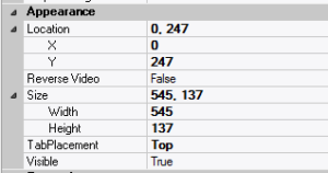
| Location | – | The location (in pixels) of this form field in relation to the top-left corner of its parent form or parent container. |
| X | – | The horizontal location of this form field. |
| Y | – | The vertical location of this form field. |
| Reverse Video | False | True → The text will appear in white on a black background; False → The text will appear in black on a white background; |
| Size | – | The size of this form field in pixels. |
| Width | – | The width of this form field. |
| Height | – | The height of this form field. |
| Visible | True | True → This form field will be visible by default. |
– Colors
| Attribute Name | Default Value | Description |
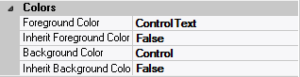
| Background Color | variable | The background color of the form field, container or user interface object in R(ed) G(reen) B(lue) values; |
| Foreground Color | variable | The foreground color of the form field, container or user interface object in R(ed) G(reen) B(lue) values. |
| Inherit Background Color | variable | True → The form field or container will inherit the background color of its parent container or parent form object. |
| Inherit Foreground Color | variable | True → The form field or container will inherit the foreground color of its parent container or parent form object. |
– Properties
| Attribute Name | Default Value | Description |
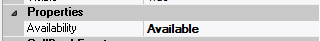
| Availability | Available | The way in which the end-user will interact with this form field: Available → This form field can receive input focus and its contents can be modified; Unavailable → This form field cannot receive input focus and its contents cannot be modified; Guarded → This form field can receive input focus but its contents cannot be modified; Protected → This form field cannot receive input focus, its contents cannot be modified and it will appear grayed-out; |
| Tab Index | 0 | The relative position of this form field in the tab sequence order for its parent container or form field; 0 → The relative position of the form field in the structure chart will be used instead. |
| Tab Stop | True | True → This form field will be included in the tab order for its parent container or form; False → |
| Z-Order | >= 10001 | The relative depth of this form field in relation to other form fields within the same parent container or form. |
– Style

| Attribute Name | Default Value | Description |
| Font | Microsoft Sans Serif, 8pt | The font in which text will be displayed inside this form field. |
| Name | Microsoft Sans Serif | The system name of the selected font. |
| Size | 8 | The size of the font in units. (Point is the default unit); |
| Bold | False | True → The text inside this form field will appear in bold. |
| Italic | False | True → The text inside this form field will appear in italic. |
| Strikeout | False | True → The text inside this form field will appear with a line across. |
| Underline | False | True → The text inside this form field will appear underlined. |
 English
  Portuguese