
How Can We Help?
The Picture
Main Characteristics of Pictures
Image form fields are used for displaying pictures.
Supported file formats are: .bmp, ico, .wmf, and .jpg.
Picture Attributes
– Identification
| Attribute Name | Default Value | Description |
| Field Type | – | The type of this form field or of this user interface object. (Read-only). |
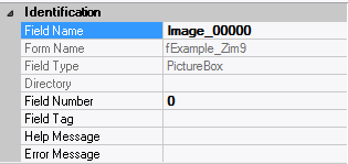
| Field Name | variable | A string that identifies this form field within the Zim application; Automatically assigned by the Zim IDE when a new form field is created; May be changed by the developer, but must always conform to the Zim Object Naming Rules and satisfy the Zim Object Uniqueness Conditions. |
| Field Number | 0 | A number that may be used to identify this form field within the Zim application and in Callback Events; May be changed by the developer and need not be unique; Value must be an integer between 0 and 999; |
| Field Tag | “” | A string that may be used to identify this form field within the Zim application and in Callback Events; May be changed by the developer and need not be unique; If left blank, the Zim IDE will assign the value of Field Name to Field Tag. |
| Directory | ZIM | The directory that owns the parent form of this form field (Read-only). |
| Form Name | – | A string that identifies the parent form of this form field (Read-only). |
| Help Message | “” | A help message that will be displayed when this form field or this menu item receives input focus; Displayed in the status bar of the window associated with the parent form of this form field (if the window object’s Status Bar attribute is set to True); Displayed in a message field if one such field exists in the parent form of this form field. |
– Appearance
| Attribute Name | Default Value | Description |
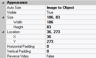
| Location | – | The location (in pixels) of this form field in relation to the top-left corner of its parent form or parent container. |
| X | – | The horizontal location of this form field. |
| Y | – | The vertical location of this form field. |
| Reverse Video | False | True → The text will appear in white on a black background; False → The text will appear in black on a white background; |
| Size | – | The size of this form field in pixels. |
| Width | – | The width of this form field. |
| Height | – | The height of this form field. |
| Visible | True | True → This form field will be visible by default. |
– Behavior
| Attribute Name | Default Value | Description |
| Auto Size | None-Clipped | None-Clipped → The image in this form field object will be displayed in its original size anchored at the top-left corner of the object. If the image is wider or taller than the object, it will be clipped horizontally or vertically to fit within the object; Image to Object → The image will occupy the entire area of the object but its aspect ratio will not be preserved; Image Proportional → The image will be scaled and centered within the object and its aspect ratio will be preserved; Object to Image → The object will be scaled to fit the image in its original size. The object cannot be resized. |
– Calback Events

| Attribute Name | Default Value | Description |
| All Callback Events | When any of the following callback event attributes is set to True, this form field will be able to trigger the corresponding callback event; After the event is triggered, the form input command will be terminated and the following values will populate the Event Vector: Event.EventType = “FormField”; Event.EventTag = the form field’s Field Tag attribute; Additional values relative to specific callback events (see below); Note: Callback events can only be triggered by a form field if it is available and contained in a form that has input focus. | |
| Click | False | Triggered when the left mouse button is clicked within this form field; Event.EventName = “Click” added to the Event Vector. |
| Double Click | False | Triggered when the left mouse button is double-clicked within this form field; Event.EventName = “DoubleClick” added to the Event Vector. |
| Got Focus | False | Triggered when a mouse click, a tab key press or an accelerator key press causes this form field to acquire the input focus; Event.EventName = “GotFocus” added to the Event Vector. |
| Lost Focus (Always) | False | Triggered when a mouse click, a tab key press or an accelerator key press causes this form field to lose the input focus; Event.EventName = “LostFocus” added to the Event Vector. |
| Right Click | False | Triggered when the right mouse button is clicked on or inside this form field; Event.EventName = “RightClick” added to the Event Vector. |
– Properties
| Attribute Name | Default Value | Description |
| Availability | Available | The way in which the end-user will interact with this form field: Available → This form field can receive input focus and its contents can be modified; Unavailable → This form field cannot receive input focus and its contents cannot be modified; Guarded → This form field can receive input focus but its contents cannot be modified; Protected → This form field cannot receive input focus, its contents cannot be modified and it will appear grayed-out; |
| Tab Index | 0 | The relative position of this form field in the tab sequence order for its parent container or form field; 0 → The relative position of the form field in the structure chart will be used instead. |
| Tab Stop | True | True → This form field will be included in the tab order for its parent container or form; False → |
| Z-Order | >= 10001 | The relative depth of this form field in relation to other form fields within the same parent container or form. |
– Style
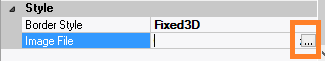
| Attribute Name | Default Value | Description |
| Border Style | variable | None; Single Line; 3D; Beveled-In; Beveled-Out |
| Image File | “” | The image file that will be displayed inside this push button; Selected by clicking  and browsing the file system; and browsing the file system;Note: This attribute is only available when Button Type = Image or Button Type = Image & Text. |
 English
  Portuguese