
How Can We Help?
The Frame
Main Characteristics of Frames
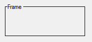
Frame form fields act as container objects for any number of any other type of form fields (including other frames). Frames do not have any associated data and hence have no assignable data type or length. The purpose of a frame is to assist in creating dialogs which have a pleasing appearance by organizing related form fields together.
The form fields owned by a frame inherit the colors, font and the availability attribute of the frame.
Frame Attributes
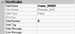
– Identification
| Attribute Name | Default Value | Description |
| Field Type | – | The type of this form field or of this user interface object. (Read-only). |
| Field Name | variable | A string that identifies this form field within the Zim application; Automatically assigned by the Zim IDE when a new form field is created; May be changed by the developer, but must always conform to the Zim Object Naming Rules and satisfy the Zim Object Uniqueness Conditions. |
| Field Number | 0 | A number that may be used to identify this form field within the Zim application and in Callback Events; May be changed by the developer and need not be unique; Value must be an integer between 0 and 999; |
| Field Tag | “” | A string that may be used to identify this form field within the Zim application and in Callback Events; May be changed by the developer and need not be unique; If left blank, the Zim IDE will assign the value of Field Name to Field Tag. |
| Directory | ZIM | The directory that owns the parent form of this form field (Read-only). |
| Form Name | – | A string that identifies the parent form of this form field (Read-only). |
| Help Message | “” | A help message that will be displayed when this form field or this menu item receives input focus; Displayed in the status bar of the window associated with the parent form of this form field (if the window object’s Status Bar attribute is set to True); Displayed in a message field if one such field exists in the parent form of this form field. |
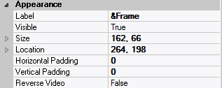
– Appearance
| Attribute Name | Default Value | Description |
| Customized Pointer | default | The pointer (or cursor) style when the pointer is hovering over (or the cursor is inside) an available form field; May be selected from the following choices in the list box: Arrow → the standard arrow cursor; Cross-hair → ; I-Beam → ; Icon → ; Resize → ; Size NE SW → ; Size NS → ; Size NW SE → ; Size WE → ; Up Arrow → ; Hourglass → ; default → The pointer style will be I-Beam for Entry Field and Arrow for all other form fields. |
| Label | ??? | The label text which appears inside or along the top border of the form field; A character in the label will be underlined if there is an ampersand (&) immediately before it. |
| Location | – | The location (in pixels) of this form field in relation to the top-left corner of its parent form or parent container. |
| X | – | The horizontal location of this form field. |
| Y | – | The vertical location of this form field. |
| Reverse Video | False | True → The text will appear in white on a black background; False → The text will appear in black on a white background; |
| Size | – | The size of this form field in pixels. |
| Width | – | The width of this form field. |
| Height | – | The height of this form field. |
| Visible | True | True → This form field will be visible by default. |
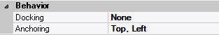
– Behavior
| Attribute Name | Default Value | Description |
| Anchoring | Top, Left | When the window associated with this form field’s parent form is resized: Top → The top edge of this form field will maintain its distance from the top edge of the window; Bottom → The bottom edge of this form field will maintain its distance from the bottom edge of the window; Left → The left edge of this form field will maintain its distance from the left edge of the window; Right → The right edge of this form field will maintain its distance from the right edge of the window; None → The same as Top, Left. |
| Docking | None | Top → The top edge of the form field will be expanded and placed; Bottom → ; Left → ; Right → ; Fill → ; None → This form field. |
– Colors
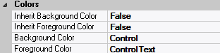
| Attribute Name | Default Value | Description |
| Background Color | variable | The background color of the form field, container or user interface object in R(ed) G(reen) B(lue) values; |
| Foreground Color | variable | The foreground color of the form field, container or user interface object in R(ed) G(reen) B(lue) values. |
| Inherit Background Color | variable | True → The form field or container will inherit the background color of its parent container or parent form object. |
| Inherit Foreground Color | variable | True → The form field or container will inherit the foreground color of its parent container or parent form object. |
– Properties
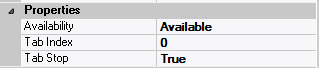
| Attribute Name | Default Value | Description |
| Availability | Available | The way in which the end-user will interact with this form field: Available → This form field can receive input focus and its contents can be modified; Unavailable → This form field cannot receive input focus and its contents cannot be modified; Guarded → This form field can receive input focus but its contents cannot be modified; Protected → This form field cannot receive input focus, its contents cannot be modified and it will appear grayed-out; |
| Tab Index | 0 | The relative position of this form field in the tab sequence order for its parent container or form field; 0 → The relative position of the form field in the structure chart will be used instead. |
| Tab Stop | True | True → This form field will be included in the tab order for its parent container or form; False → |
| Z-Order | >= 10001 | The relative depth of this form field in relation to other form fields within the same parent container or form. |
– Style
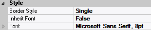
| Attribute Name | Default Value | Description |
| Border Style | variable | None; Single Line; 3D; Beveled-In; Beveled-Out |
| Font | Microsoft Sans Serif, 8pt | The font in which text will be displayed inside this form field. |
| Name | Microsoft Sans Serif | The system name of the selected font. |
| Size | 8 | The size of the font in units. (Point is the default unit); |
| Bold | False | True → The text inside this form field will appear in bold. |
| Italic | False | True → The text inside this form field will appear in italic. |
| Strikeout | False | True → The text inside this form field will appear with a line across. |
| Underline | False | True → The text inside this form field will appear underlined. |
| Inherit Font | False | True → This form field will inherit all the Font attributes from its parent (form, frame or tab control). |
 English
  Portuguese