
The Entry Field
Main Characteristics of Entry Fields
Entry form fields are most commonly used for displaying data to the end user, accepting data from the application end-user, or both. The data length of an entry field is independent of its physical dimensions. If the width of the entry field is too small to display all its associated data, the data can be scrolled left and right within the entry field object. Entry fields can also be defined as multi-line fields with or without associated vertical scroll bars. It this case, the data content is automatically wrapped within the physical width of the field. Entry fields can also be assigned alphabetic case adjustment options, justification options, validation rules, and both display and input data masks.
All the different availability attributes can be assigned to entry fields. Unavailable entry fields have their data content displayed in the “inactive text” color. Protected entry fields have their data content displayed in the “active text” color. Guarded entry fields have their data content displayed in the “active text” color and can be scrolled left and right (plus up and down for multi-line fields). Available entry fields have their data content displayed in the “active text” color, can be scrolled left and right (plus up and down for multi-line fields) and can have their data content modified by the application end-user.
Entry Field Attributes
Identification

| Attribute Name | Default Value | Description |
| Field Type | – | The type of this form field or of this user interface object. (Read-only). |
| Field Name | variable | A string that identifies this form field within the Zim application; Automatically assigned by the Zim IDE when a new form field is created; May be changed by the developer, but must always conform to the Zim Object Naming Rules and satisfy the Zim Object Uniqueness Conditions. |
| Field Number | 0 | A number that may be used to identify this form field within the Zim application and in Callback Events; May be changed by the developer and need not be unique; Value must be an integer between 0 and 999; |
| Field Tag | “” | A string that may be used to identify this form field within the Zim application and in Callback Events; May be changed by the developer and need not be unique; If left blank, the Zim IDE will assign the value of Field Name to Field Tag. |
| Directory | ZIM | The directory that owns the parent form of this form field (Read-only). |
| Form Name | – | A string that identifies the parent form of this form field (Read-only). |
| Help Message | “” | A help message that will be displayed when this form field or this menu item receives input focus; Displayed in the status bar of the window associated with the parent form of this form field (if the window object’s Status Bar attribute is set to True); Displayed in a message field if one such field exists in the parent form of this form field. |
Appearance

| Attribute Name | Default Value | Description |
| Customized Pointer | default | The pointer (or cursor) style when the pointer is hovering over (or the cursor is inside) an available form field; May be selected from the following choices in the list box: Arrow → the standard arrow cursor; Cross-hair → ; I-Beam → ; Icon → ; Resize → ; Size NE SW → ; Size NS → ; Size NW SE → ; Size WE → ; Up Arrow → ; Hourglass → ; default → The pointer style will be I-Beam for Entry Field and Arrow for all other form fields. |
| Fill Character | ” “ | The character used to fill blank spaces in this form field. |
| Location | – | The location (in pixels) of this form field in relation to the top-left corner of its parent form or parent container. |
| X | – | The horizontal location of this form field. |
| Y | – | The vertical location of this form field. |
| Multi-Line | False | True → This Entry Field will display its contents in multiples lines; Note: When set to True, the Visible Lines attribute becomes available and determines the number of lines that will appear in the Entry Field. |
| Reverse Video | False | True → The text will appear in white on a black background; False → The text will appear in black on a white background; |
| Scroll Bars | True | True → This window will have scroll bars; Scroll bars will appear when this window hosts an object (form or display) whose dimensions are larger than its own. |
| Size | – | The size of this form field in pixels. |
| Width | – | The width of this form field. |
| Height | – | The height of this form field. |
| Visible | True | True → This form field will be visible by default. |
| Visible Lines | 1 | The number of visible lines in this entry field, list box or combination list box. |
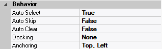
Behavior
| Attribute Name | Default Value | Description |
| Anchoring | Top, Left | When the window associated with this form field’s parent form is resized: Top → The top edge of this form field will maintain its distance from the top edge of the window; Bottom → The bottom edge of this form field will maintain its distance from the bottom edge of the window; Left → The left edge of this form field will maintain its distance from the left edge of the window; Right → The right edge of this form field will maintain its distance from the right edge of the window; None → The same as Top, Left. |
| Auto Select | False | True → The contents or state of this form field will be automatically highlighted when it receives input focus. |
| Auto Skip | False | True → The input focus will automatically skip to the next available form field after the value or state of this form field has been modified. |
| Docking | None | Top → The top edge of the form field will be expanded and placed; Bottom → ; Left → ; Right → ; Fill → ; None → This form field. |
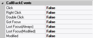
Callback Events
| Attribute Name | Default Value | Description |
| All Callback Events | When any of the following callback event attributes is set to True, this form field will be able to trigger the corresponding callback event; After the event is triggered, the form input command will be terminated and the following values will populate the Event Vector: Event.EventType = “FormField”; Event.EventTag = the form field’s Field Tag attribute; Additional values relative to specific callback events (see below); Note: Callback events can only be triggered by a form field if it is available and contained in a form that has input focus. | |
| Click | False | Triggered when the left mouse button is clicked within this form field; Event.EventName = “Click” added to the Event Vector. |
| Double Click | False | Triggered when the left mouse button is double-clicked within this form field; Event.EventName = “DoubleClick” added to the Event Vector. |
| Got Focus | False | Triggered when a mouse click, a tab key press or an accelerator key press causes this form field to acquire the input focus; Event.EventName = “GotFocus” added to the Event Vector. |
| Lost Focus (Always) | False | Triggered when a mouse click, a tab key press or an accelerator key press causes this form field to lose the input focus; Event.EventName = “LostFocus” added to the Event Vector. |
| Lost Focus (When Modified) | False | Triggered when a mouse click, a tab key press or an accelerator key press causes this form field to lose the input focus after its value has been modified (cf. Modified below); Event.EventName = “LostFocusModified” added to the Event Vector. |
| Modified | False | Triggered when the value or state of this form field is modified by a left mouse button click; Event.EventName = “Modified” added to Event Vector. |
| Right Click | False | Triggered when the right mouse button is clicked on or inside this form field; Event.EventName = “RightClick” added to the Event Vector. |
Colors

| Attribute Name | Default Value | Description |
| Background Color | variable | The background color of the form field, container or user interface object in R(ed) G(reen) B(lue) values; |
| Foreground Color | variable | The foreground color of the form field, container or user interface object in R(ed) G(reen) B(lue) values. |
| Inherit Background Color | variable | True → The form field or container will inherit the background color of its parent container or parent form object. |
| Inherit Foreground Color | variable | True → The form field or container will inherit the foreground color of its parent container or parent form object. |
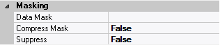
Masking
| Attribute Name | Default Value | Description |
| Compress Mask | False | The data value delivered to the variable corresponding to this form field includes the data value typed by the end-user: False → and also includes the mask characters; True → but does not include the mask characters. |
| Display Mask | “” | The character mask used when data is displayed in this entry field. |
| Input Mask | “” | The character mask used when data is being typed in this entry field. |
| Suppress | False | Each character typed into this entry field is displayed as: False → the character itself. True → the asterisk character (*); Note: This option is often used for password entry fields; |
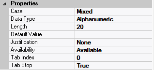
Properties
| Attribute Name | Default Value | Description |
| Availability | Available | The way in which the end-user will interact with this form field: Available → This form field can receive input focus and its contents can be modified; Unavailable → This form field cannot receive input focus and its contents cannot be modified; Guarded → This form field can receive input focus but its contents cannot be modified; Protected → This form field cannot receive input focus, its contents cannot be modified and it will appear grayed-out; |
| Case | Mixed | The case in which the data contents of this form field will be displayed: Mixed → The data will be presented in its original case; Upper → The data will be displayed in upper case; Lower → The data will be displayed in lower case. |
| Data Type | Alphanumeric | The data type of this form field: Alphanumeric → May contain letters, digits and punctuation; Non-Digit → May contain all characters except digits; Numeric → May contain digits, decimal point, plus and minus signs; Date → May contain digits according to the form specified in Input Mask; |
| Default Data Value | “” | The default data value of this form field. |
| Length | 20 | The length of the data displayed in this form field |
| Justification | None | The justification applied to the contents of this form field: Left or None → the contents will be displayed left-aligned; Right → the contents will be displayed right-aligned; Center → the contents will be displayed centered. |
| Tab Index | 0 | The relative position of this form field in the tab sequence order for its parent container or form field; 0 → The relative position of the form field in the structure chart will be used instead. |
| Tab Stop | True | True → This form field will be included in the tab order for its parent container or form; False → |
| Z-Order | >= 10001 | The relative depth of this form field in relation to other form fields within the same parent container or form. |
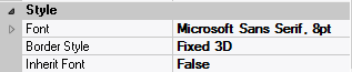
Style
| Attribute Name | Default Value | Description |
| Border Style | variable | None; Single Line; 3D; Beveled-In; Beveled-Out |
| Font | Microsoft Sans Serif, 8pt | The font in which text will be displayed inside this form field. |
| Name | Microsoft Sans Serif | The system name of the selected font. |
| Size | 8 | The size of the font in units. (Point is the default unit); |
| Bold | False | True → The text inside this form field will appear in bold. |
| Italic | False | True → The text inside this form field will appear in italic. |
| Strikeout | False | True → The text inside this form field will appear with a line across. |
| Underline | False | True → The text inside this form field will appear underlined. |
| Inherit Font | False | True → This form field will inherit all the Font attributes from its parent (form, frame or tab control). |
Validation

| Attribute Name | Default Value | Description |
| Accept Abreviations | False | False → The data value entered into this form field or the value of the selected list item must always completely match a validation rule; True → The data value entered into this form field or the value of the selected list item can partially match a validation rule; For example: if the validation rule for this field were AAA9999, a data value of AAA1 would be accepted for Val_Accept_Abreviations = True, but rejected for Val_Accept_Abreviations = False. |
| Blank is NULL | False | True → a blank value (“”) in this form field will be translated to the Zim null value ($Null). |
| Error Message | “” | An error message that will be displayed when the entered or selected value in this form field fails the Validation Rule; Displayed in the status bar of the window associated with the parent form of this form field (if the window object’s Status Bar attribute is set to True); Displayed in a message field if one such field exists in the parent form of this form field; |
| Minimum Input Length | 0 | The minimum number of characters that: must be entered into this form field, or the minimum number of characters in a selected list item for the combo box data value to be valid. |
| Validation Rule | “” | The data validation rule that defines a legal value for this form field. |
| Value Required | “” | No → A blank value (“”) in this form field is accepted as valid input; Yes → A non-blank value must be entered or selected in this form field before is parent form can lose input focus; Immediate → a non-blank value must be entered or selected in this form field before the form field itself can lose input focus. |
 English
  Portuguese