Starting Zim IDE

ZimIDE at a Glance

The Zim Integrated Development Environment (ZimIDE) is a comprehensive tool designed for creating graphical user interfaces (GUIs) for Zim database applications. It enhances and integrates the functionalities of three previously separate development components for Zim applications:

  • Zim Painter
  • Zim Development Center
  • Data Dictionary Browser

ZIM Corporation is dedicated to the ongoing development and enhancement of ZimIDE and the Zim language, ensuring continuous evolution with new features and improvements.

General Features

  • Local and remote application development
  • Multiuser application development
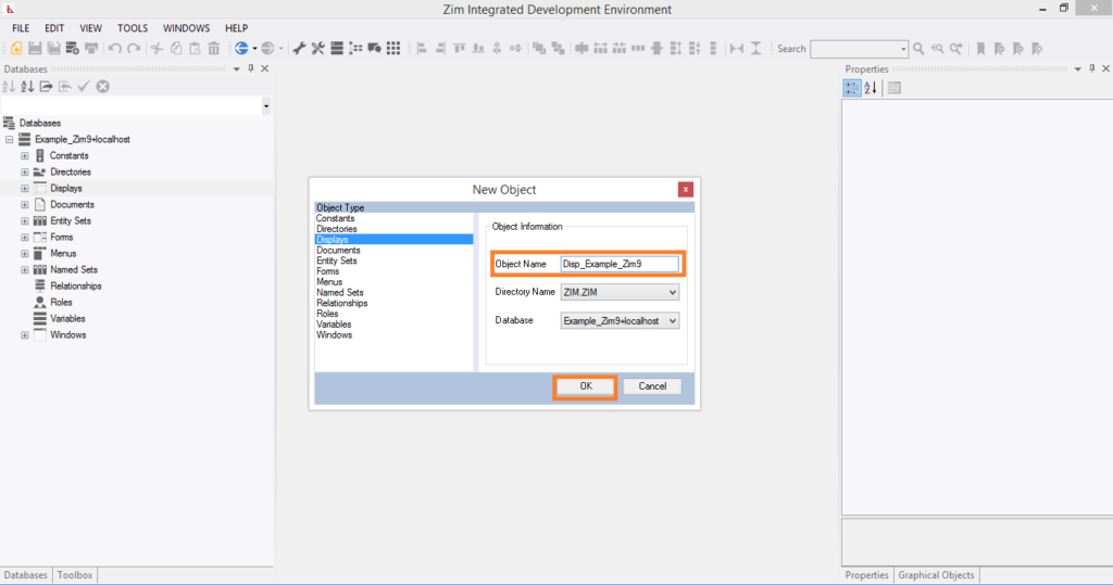
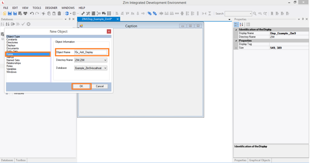
  • Design and edit forms and displays in both GUI and TUI applications
  • Supports all Zim 9.50 platforms (Windows, Linux, iOS, Android)
  • Connect to multiple databases simultaneously
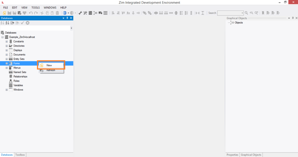
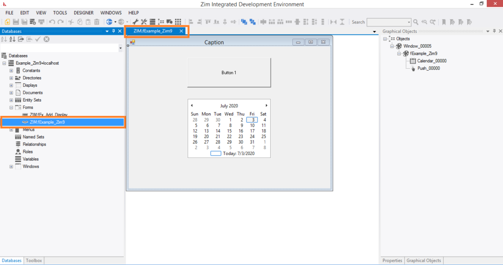
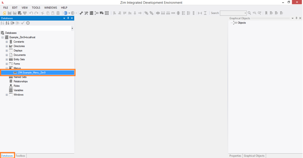
  • Browse the entire data dictionary through the Tree View Tab Page

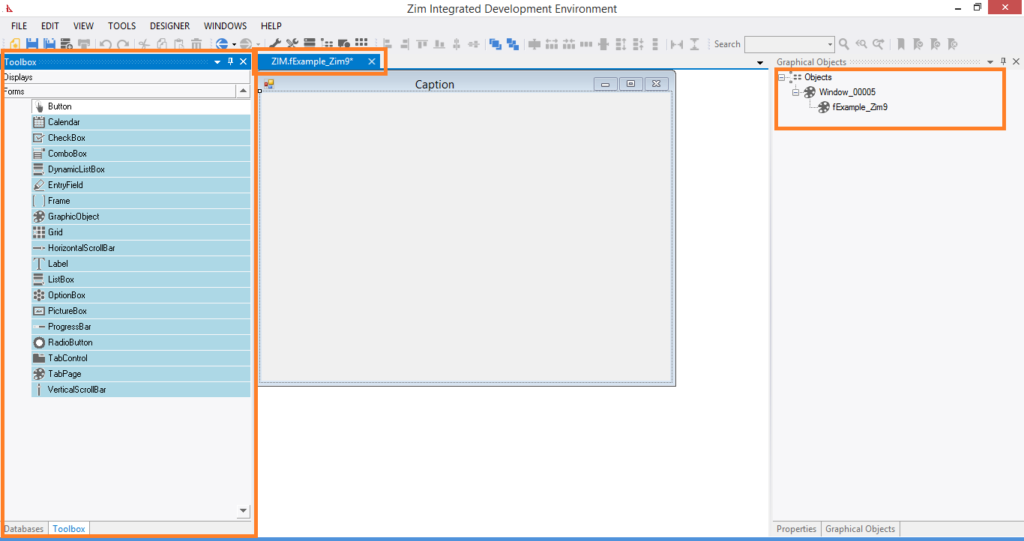
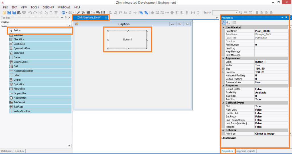
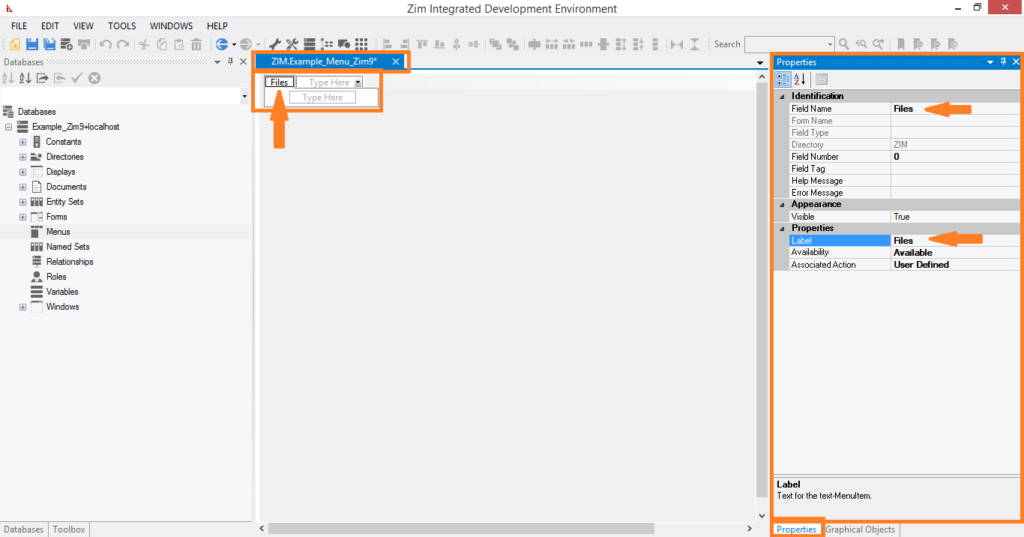
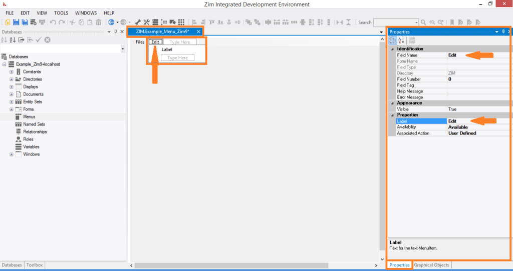
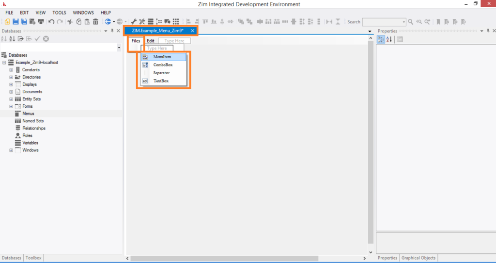
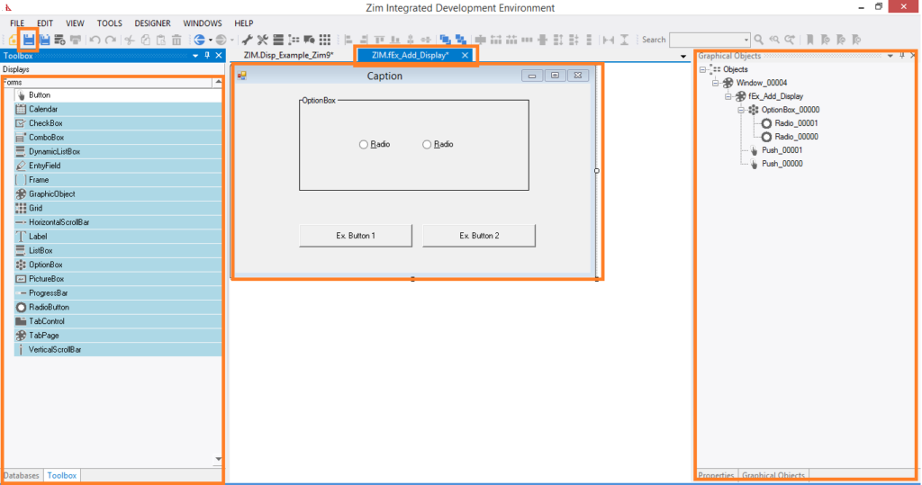
Graphical User Interface Designer

New user interface objects for Zim 9.50:

  • Grid Control (from Zim 7.x)
  • Tab Control and Tab Page (managed automatically by the client, no extra Zim code required)
  • Tool Strip

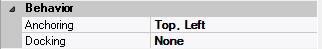
New attributes for form fields:
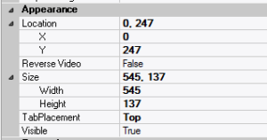
  • Anchoring
  • Docking
  • The Attributes Tab Page can be configured to be always visible
  • Create and edit multiple objects simultaneously
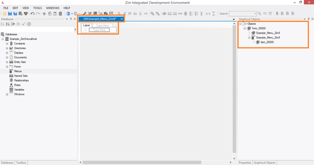
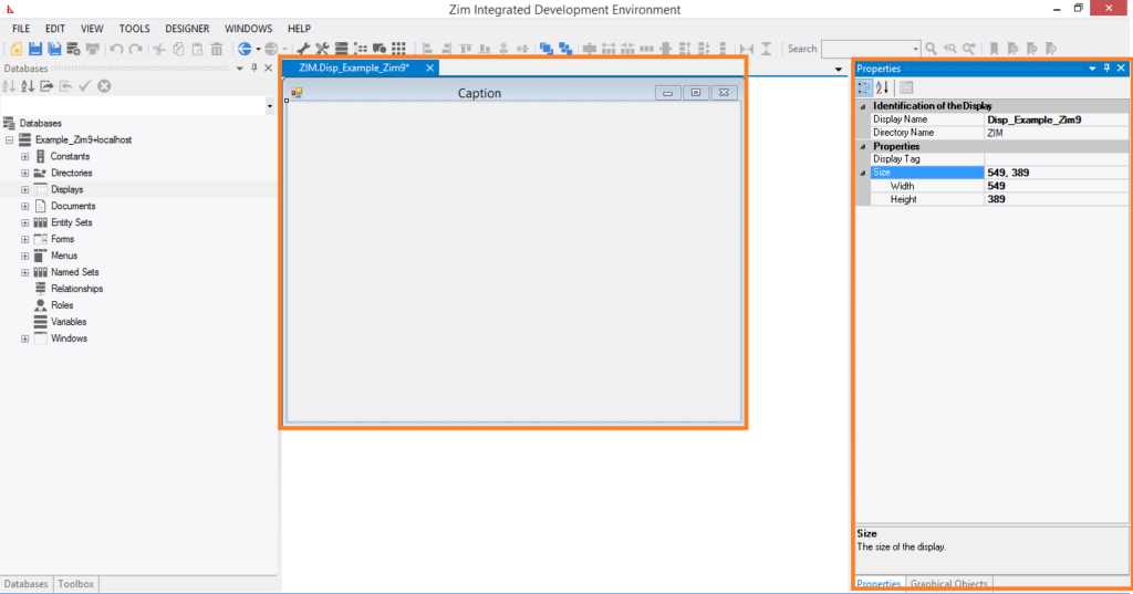
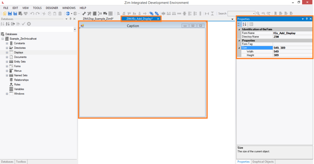
  • Modern tabbed development interface: Each Form, Display, Window, Menu, and Document stays open in its own tab page

Document Editor

Designed as an embedded specialized editor for Zim application programs and other documents:

  • Syntax highlighting customized for the Zim language
  • Region expanding and contracting

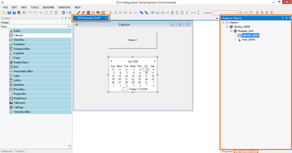
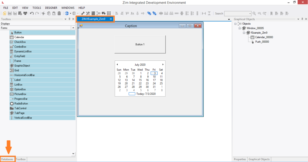
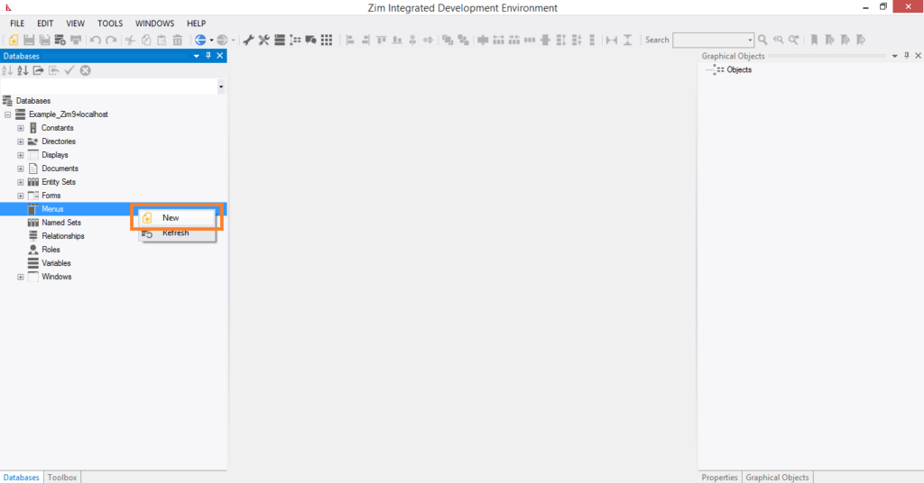
Database Viewer Tab Page

Simultaneously browse every database currently connected to the development environment in a single tab page.


Starting Zim IDE

1. Starting Zim IDE from Zim Thin Client

You can invoke Zim IDE directly from Zim Thin Client or Zim QT (available in Zim 9.00):

  • Initialization: Zim IDE will initialize using the database connection from your current Zim Thin Client or Zim QT session.

2. Starting Zim IDE Directly

From the Zim installation directory:

  • Execute or double-click on the file ZimIDE.exe.

Alternatively, you can use shortcuts:

  • Desktop shortcut
  • Quick Launch toolbar
  • Start menu: Start → (All) Programs → ZIM → Zim 9.00 (or Zim 7.21) → Zim IDE

When starting directly, you’ll need to provide all necessary connection information since it’s not using an existing session.
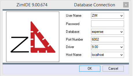

Where:

User NameUser name from “users” table in the Zim database.  “ZIM” is default user.
PasswordPassword for user.  Default “ZIM” user has no password.
DatabaseLogical name of the database you are connecting to as it is defined in the file zimdb.zim, located in the ZIM install directory.
Port NumberPort that Zim Server is listening on.  The default port for Zim 9.00 is 6002, the default port for Zim 7.11 is 5001..
DriverSelect the driver version that matches the version of Zim that you are using.
Host NameThe IP Address or name of the computer that is hosting Zim Server.  You can use “localhost” if Zim Server is running on the same machine as Zim IDE.


Zim Object Naming Rules


Valid Zim object names can be 1 to 18 characters in length. Valid characters for inclusion in an object name include the dollar sign ($), the underscore character (_), the letters a through z and A through Z, and the digits 0 through 9. The first character of an object name must be either a letter or a dollar sign.

Forms

Main Characteristics of Form Objects

✓ A form acts as a container for the form fields objects it owns

✓ Form objects do not have any visual attributes other than implicit dimensions

✓  The visual appearance of a form is the result of the visual attributes of the form fields owned by each of the forms  owned by the display

✓ The dimensions of a form are considered to be the internal dimensions (i.e. the client area) of the window

✓ The Property Tab is not available for display objects

✓ The Zim language includes an extensive suite of commands for dynamically modifying both the visual and behavioral characteristics the form fields owned by forms

✓ The UI Designer supports the creation of associations among windows, menus and displays so that they can be       viewed and/or edited as a group.

Creation of Forms step by step:


The Menu Item

Main Characteristics of Menu Item Objects


Menu item objects deliver both the visual and behavioral characteristics of menu objects. Menu items can be owned directly by the menu. In this case they appear on the menu “bar”. A menu item owned by the menu can itself own other menu items. This enables menu lists to be constructed. Even menu items in a list can own other menu items. This enables “cascading” menu structures to be constructed. Menus thus provide a flexible mechanism for enabling the application end-user to control the execution flow through an application. Although the selection of a particular menu item is generally interpreted by the application program, many predefined system actions can also be associated with menu items. Menu items can also be defined to exhibit the “On/Off” binary state condition. To inspect the attributes supported by the painter for menu item objects, display the Edit Menu Item dialog by double clicking on the menu item. The Zim language includes a suite of commands for dynamically modifying both the visual and behavioral characteristics of menu item objects.


Creation of Menu Item step by step:

Menus


Main Characteristics of Menu Objects


 ✓ The visual attribute of a menu object is the menu bar located at the top of the client area of a window

✓ Menu objects are owners of menu item objects

✓ The Zim language includes an extensive suite of commands for dynamically modifying both the visual and the behavioral characteristics of the menu items owned by menus

✓ The UI Designer supports the creation of associations between windows, menus and either forms or displays so that they can be viewed and/or edited as a group


Adding Menu Objects


A menu object can be added only to the Designer workspace when the UI Designer has been invoked by either FORM DEFINE or DISPLAY DEFINE;

Note that only windows that are resizable, have a caption bar, and are not clipped to their parent window can accept menus;

If you have modified the window’s attributes such that any one of these conditions is not true, then an error dialog to that effect is displayed when you attempt to add the menu;

You need to edit the window’s attributes (double click in an empty area within the window), such that these conditions are true before a menu can be accepted.

A menu object is added by clicking on the icon in the object gallery that represents the menu object type.

It is generally the icon second from the end at the right of the gallery. At some screen resolutions, you have to scroll the gallery using the large scroll arrows located at either end for the menu object to come into view.

When the cursor takes the form of an outline image of the menu icon, click anywhere within the window.

The menu bar appears at the top of the window and the Add Menu dialog is displayed.

Note that a menu has only attributes which relate to identification.

Its visual attributes are fixed, as it always appears as a horizontal menu bar at the top of a window. You can also change any menu attribute at a later time by displaying the Edit Menu dialog.

There are other ways to add menus. You can import a menu whose definition exists in the Data Dictionary. You can also paste a menu which has been either cut or copied from another painter session.

The Add Menu Dialog

Menu objects can be added only when the painter has been invoked by either the FORM DEFINE or the DISPLAY DEFINE command, or a form or display object has been selected for editing from within the Zim IDE Development. The Add Menu dialog is presented when a menu object is selected from the Object Gallery and placed within the window in the Presentation Area. Except for the caption, this dialog is identical to the Edit Menu dialog. Refer to the Add Menu dialog for a detailed description of the fields in this dialog.


Creation of Forms step by step:


Windows

Main Characteristics of Window

In Zim applications, window objects are visually identical to standard windows in Microsoft Windows;

The visual and behavioral attributes of window objects are fully customizable by the Zim IDE via the Properties Tab;

The Zim language includes an extensive suite of commands for dynamically modifying both the visual and behavioral characteristics of window objects;

The Zim IDE supports the creation of associations among windows, menus, and either forms or displays so that they can be viewed and/or edited as a group;

A window object may be created directly by the developer or by the Zim IDE, in which case it is created automatically when the user creates a form or a display;

Window objects do not own user interface objects. Instead, they act as an interface between the operating system and forms, displays or menus.

Establishing a Window

Call up the Zim IDE, select WINDOWS from the DataBases menu, and use the tools of the Zim IDE Development to define the desired Windows.

Creation of Window step by step:

Displays

Main Characteristics of Display Objects


✓ A display acts as a container for the form objects it owns.

✓ Display objects do not have any visual attributes other than implicit dimensions.

✓ The visual appearance of a display is the result of the visual attributes of the form fields owned by each of the forms           owned by the display;

✓ The dimensions of a display are considered to be the internal dimensions (i.e. the client area) of the window.

✓ The Property Tab is not available for display objects.

✓ The Zim  IDE supports the creation of associations among windows, menus and displays so that they can be                    viewed and/or edited as a group.

DISPLAY DEFINE If the painter was invoked by DISPLAY DEFINE, then every object type can be added. If the        display  does not already exist (i.e. there is no definition data for it in the Zim Data Dictionary), the paint window contains no forms. If the display does exist, the painter loads the forms owned by the display (and for each form, its form fields), into the paint window. Note that for a display to exist, it must own at least one form. In DISPLAY DEFINE, the display itself is not visible. The display is implicitly considered to be the client area of (i.e. the area within), the window. Hence resizing the window also resizes the display. If an association had previously been established between the display and a particular window, then that window is loaded as the paint window. If the association includes a reference to a particular menu, then that menu is also loaded and displayed within the paint window.

Creation of Display step by step:


Invisible Form Fields

Selecting an invisible Form Field

In the previous versions of Zim Painter, it was possible to select an invisible field with the mouse, as long as its location within the form was known.

In Zim IDE, the only way to select an invisible form field is by clicking on the field name in the Zim Object Tree View tab page.

Moving an Invisible Form Field

The are two ways to move an invisible form field:

making it temporarily visible before moving it and then making it invisible again;

changing its Location attribute directly in the Attributes Tab Page.

The Tab Page

Main Characteristics of Tab Pages

Adds a single tab page to the tab control container.


Tab Page Attributes

– Identification

Attribute NameDefault ValueDescription
Field TypeThe type of this form field or of this user interface object. (Read-only).
Field NamevariableA string that identifies this form field within the Zim application;
Automatically assigned by the Zim IDE when a new form field is created;
May be changed by the developer, but must always conform to the Zim Object Naming Rules and satisfy the Zim Object Uniqueness Conditions.
Field Number0A number that may be used to identify this form field within the Zim application and in Callback Events;
May be changed by the developer and need not be unique;
Value must be an integer between 0 and 999;
Field Tag“”A string that may be used to identify this form field within the Zim application and in Callback Events;
May be changed by the developer and need not be unique;
If left blank, the Zim IDE will assign the value of Field Name to Field Tag.
DirectoryZIMThe directory that owns the parent form of this form field (Read-only).
Form NameA string that identifies the parent form of this form field (Read-only).
Help Message“”A help message that will be displayed when this form field or this menu item receives input focus;
Displayed in the status bar of the window associated with the parent form of this form field (if the window object’s Status Bar attribute is set to True);
Displayed in a message field if one such field exists in the parent form of this form field.


– Appearance

Attribute NameDefault ValueDescription
Customized PointerdefaultThe pointer (or cursor) style when the pointer is hovering over (or the cursor is inside) an available form field;
May be selected from the following choices in the list box:
Arrow →  the standard arrow cursor;
Cross-hair →  ;
I-Beam →  ;
Icon →  ;
Resize →  ;
Size NE SW →  ;
Size NS →  ;
Size NW SE →  ;
Size WE →  ;
Up Arrow →  ;
Hourglass →  ;
default →  The pointer style will be I-Beam for Entry Field and Arrow for all other form fields.
Label???The label text which appears inside or along the top border of the form field;
A character in the label will be underlined if there is an ampersand (&) immediately before it.
LocationThe location (in pixels) of this form field in relation to the top-left corner of its parent form or parent container.
XThe horizontal location of this form field.
YThe vertical location of this form field.
Reverse VideoFalseTrue →  The text will appear in white on a black background;
False →  The text will appear in black on a white background;
SizeThe size of this form field in pixels.
WidthThe width of this form field.
HeightThe height of this form field.
VisibleTrueTrue →  This form field will be visible by default.


– Colors

Attribute NameDefault ValueDescription
Background ColorvariableThe background color of the form field, container or user interface object in R(ed) G(reen) B(lue) values;
Foreground ColorvariableThe foreground color of the form field, container or user interface object in R(ed) G(reen) B(lue) values.
Inherit Background ColorvariableTrue →  The form field or container will inherit the background color of its parent container or parent form object.
Inherit Foreground ColorvariableTrue →  The form field or container will inherit the foreground color of its parent container or parent form object.


– Properties

Attribute NameDefault ValueDescription
AvailabilityAvailableThe way in which the end-user will interact with this form field:
Available →  This form field can receive input focus and its contents can be modified;
Unavailable →  This form field cannot receive input focus and its contents cannot be modified;
Guarded →  This form field can receive input focus but its contents cannot be modified;
Protected →  This form field cannot receive input focus, its contents cannot be modified and it will appear grayed-out;
Tab Index0The relative position of this form field in the tab sequence order for its parent container or form field;
0 →  The relative position of the form field in the structure chart will be used instead.
Tab StopTrueTrue →  This form field will be included in the tab order for its parent container or form;
False →  
Z-Order>= 10001The relative depth of this form field in relation to other form fields within the same parent container or form.


– Style

Attribute NameDefault ValueDescription
FontMicrosoft Sans Serif, 8ptThe font in which text will be displayed inside this form field.
NameMicrosoft Sans SerifThe system name of the selected font.
Size8The size of the font in units. (Point is the default unit);
BoldFalseTrue →  The text inside this form field will appear in bold.
ItalicFalseTrue →  The text inside this form field will appear in italic.
StrikeoutFalseTrue →  The text inside this form field will appear with a line across.
UnderlineFalseTrue →  The text inside this form field will appear underlined.

The Tab Control

Main Characteristics of Tab Controls

A Tab Control mimics the behavior of dividers in a notebook, or labels in a file.  By using a tab control, an application can define multiple pages for the same area within a window.


The tab control object is a container for tab pages.  Once you have added a tab control to your project, you may proceed to add tab pages to the tab control.


Note: Unlike previous incarnations of the Zim tab control where one had to change the front to back order of frames to edit the individual tab pages, and where the programmer was required to add code to manage and manipulate the tab control, this is a true windows tab control object.  To edit the individual tab pages, double click on the desired tab header.  No coding is required for this tab control as it is managed by Windows.


The version of the tab control available in this development environment is only supported by Zim 8.50 (or higher) clients.


Tab Control Attributes

– Identification


Attribute NameDefault ValueDescription
Field TypeThe type of this form field or of this user interface object. (Read-only).
Field NamevariableA string that identifies this form field within the Zim application;
Automatically assigned by the Zim IDE when a new form field is created;
May be changed by the developer, but must always conform to the Zim Object Naming Rules and satisfy the Zim Object Uniqueness Conditions.
Field Number0A number that may be used to identify this form field within the Zim application and in Callback Events;
May be changed by the developer and need not be unique;
Value must be an integer between 0 and 999;
Field Tag“”A string that may be used to identify this form field within the Zim application and in Callback Events;
May be changed by the developer and need not be unique;
If left blank, the Zim IDE will assign the value of Field Name to Field Tag.
DirectoryZIMThe directory that owns the parent form of this form field (Read-only).
Form NameA string that identifies the parent form of this form field (Read-only).
Help Message“”A help message that will be displayed when this form field or this menu item receives input focus;
Displayed in the status bar of the window associated with the parent form of this form field (if the window object’s Status Bar attribute is set to True);
Displayed in a message field if one such field exists in the parent form of this form field.


– Appearance

Attribute NameDefault ValueDescription
Customized PointerdefaultThe pointer (or cursor) style when the pointer is hovering over (or the cursor is inside) an available form field;
May be selected from the following choices in the list box:
Arrow →  the standard arrow cursor;
Cross-hair →  ;
I-Beam →  ;
Icon →  ;
Resize →  ;
Size NE SW →  ;
Size NS →  ;
Size NW SE →  ;
Size WE →  ;
Up Arrow →  ;
Hourglass →  ;
default →  The pointer style will be I-Beam for Entry Field and Arrow for all other form fields.
Label???The label text which appears inside or along the top border of the form field;
A character in the label will be underlined if there is an ampersand (&) immediately before it.
LocationThe location (in pixels) of this form field in relation to the top-left corner of its parent form or parent container.
XThe horizontal location of this form field.
YThe vertical location of this form field.
Reverse VideoFalseTrue →  The text will appear in white on a black background;
False →  The text will appear in black on a white background;
SizeThe size of this form field in pixels.
WidthThe width of this form field.
HeightThe height of this form field.
VisibleTrueTrue →  This form field will be visible by default.


– Behavior

Attribute NameDefault ValueDescription
AnchoringTop, LeftWhen the window associated with this form field’s parent form is resized:
Top →  The top edge of this form field will maintain its distance from the top edge of the window;
Bottom →  The bottom edge of this form field will maintain its distance from the bottom edge of the window;
Left →  The left edge of this form field will maintain its distance from the left edge of the window;
Right →  The right edge of this form field will maintain its distance from the right edge of the window;
None →  The same as TopLeft.
DockingNoneTop →  The top edge of the form field will be expanded and placed;
Bottom →  ;
Left →  ;
Right →  ;
Fill →  ;
None →  This form field.


– Colors

Attribute NameDefault ValueDescription
Background ColorvariableThe background color of the form field, container or user interface object in R(ed) G(reen) B(lue) values;
Foreground ColorvariableThe foreground color of the form field, container or user interface object in R(ed) G(reen) B(lue) values.
Inherit Background ColorvariableTrue →  The form field or container will inherit the background color of its parent container or parent form object.
Inherit Foreground ColorvariableTrue →  The form field or container will inherit the foreground color of its parent container or parent form object.


– Properties

Attribute NameDefault ValueDescription
AvailabilityAvailableThe way in which the end-user will interact with this form field:
Available →  This form field can receive input focus and its contents can be modified;
Unavailable →  This form field cannot receive input focus and its contents cannot be modified;
Guarded →  This form field can receive input focus but its contents cannot be modified;
Protected →  This form field cannot receive input focus, its contents cannot be modified and it will appear grayed-out;
Tab Index0The relative position of this form field in the tab sequence order for its parent container or form field;
0 →  The relative position of the form field in the structure chart will be used instead.
Tab StopTrueTrue →  This form field will be included in the tab order for its parent container or form;
False →  
Z-Order>= 10001The relative depth of this form field in relation to other form fields within the same parent container or form.


– Style

Attribute NameDefault ValueDescription
Border StylevariableNone;   Single Line;      3D;       Beveled-In;       Beveled-Out
FontMicrosoft Sans Serif, 8ptThe font in which text will be displayed inside this form field.
NameMicrosoft Sans SerifThe system name of the selected font.
Size8The size of the font in units. (Point is the default unit);
BoldFalseTrue →  The text inside this form field will appear in bold.
ItalicFalseTrue →  The text inside this form field will appear in italic.
StrikeoutFalseTrue →  The text inside this form field will appear with a line across.
UnderlineFalseTrue →  The text inside this form field will appear underlined.
Inherit FontFalseTrue →  This form field will inherit all the Font attributes from its parent (form, frame or tab control).
en_CAEnglish