
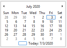
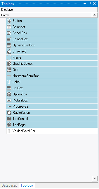
Main Characteristics of Calendars
Calendar Attributes
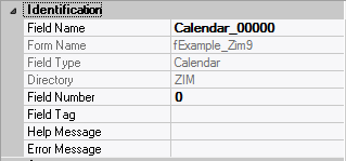
– Identification
| Attribute Name | Default Value | Description |
| Field Type | – | The type of this form field or of this user interface object. (Read-only). |
| Field Name | variable | A string that identifies this form field within the Zim application; Automatically assigned by the Zim IDE when a new form field is created; May be changed by the developer, but must always conform to the Zim Object Naming Rules and satisfy the Zim Object Uniqueness Conditions. |
| Field Number | 0 | A number that may be used to identify this form field within the Zim application and in Callback Events; May be changed by the developer and need not be unique; Value must be an integer between 0 and 999; |
| Field Tag | “” | A string that may be used to identify this form field within the Zim application and in Callback Events; May be changed by the developer and need not be unique; If left blank, the Zim IDE will assign the value of Field Name to Field Tag. |
| Directory | ZIM | The directory that owns the parent form of this form field (Read-only). |
| Form Name | – | A string that identifies the parent form of this form field (Read-only). |
| Help Message | “” | A help message that will be displayed when this form field or this menu item receives input focus; Displayed in the status bar of the window associated with the parent form of this form field (if the window object’s Status Bar attribute is set to True); Displayed in a message field if one such field exists in the parent form of this form field. |
– Appearance
| Attribute Name | Default Value | Description |
| Customized Pointer | default | The pointer (or cursor) style when the pointer is hovering over (or the cursor is inside) an available form field; May be selected from the following choices in the list box: Arrow → the standard arrow cursor; Cross-hair → ; I-Beam → ; Icon → ; Resize → ; Size NE SW → ; Size NS → ; Size NW SE → ; Size WE → ; Up Arrow → ; Hourglass → ; default → The pointer style will be I-Beam for Entry Field and Arrow for all other form fields. |
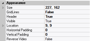
| Location | – | The location (in pixels) of this form field in relation to the top-left corner of its parent form or parent container. |
| X | – | The horizontal location of this form field. |
| Y | – | The vertical location of this form field. |
| Reverse Video | False | True → The text will appear in white on a black background; False → The text will appear in black on a white background; |
| Size | – | The size of this form field in pixels. |
| Width | – | The width of this form field. |
| Height | – | The height of this form field. |
| Visible | True | True → This form field will be visible by default. |
– Behavior
| Attribute Name | Default Value | Description |
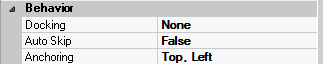
| Anchoring | Top, Left | When the window associated with this form field’s parent form is resized: Top → The top edge of this form field will maintain its distance from the top edge of the window; Bottom → The bottom edge of this form field will maintain its distance from the bottom edge of the window; Left → The left edge of this form field will maintain its distance from the left edge of the window; Right → The right edge of this form field will maintain its distance from the right edge of the window; None → The same as Top, Left. |
| Auto Skip | False | True → The input focus will automatically skip to the next available form field after the value or state of this form field has been modified. |
| Docking | None | Top → The top edge of the form field will be expanded and placed; Bottom → ; Left → ; Right → ; Fill → ; None → This form field. |
– Callback Events
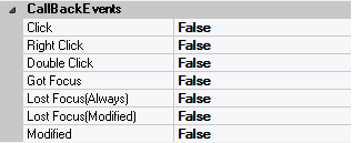
| Attribute Name | Default Value | Description |
| All Callback Events | When any of the following callback event attributes is set to True, this form field will be able to trigger the corresponding callback event; After the event is triggered, the form input command will be terminated and the following values will populate the Event Vector: Event.EventType = “FormField”; Event.EventTag = the form field’s Field Tag attribute; Additional values relative to specific callback events (see below); Note: Callback events can only be triggered by a form field if it is available and contained in a form that has input focus. | |
| Click | False | Triggered when the left mouse button is clicked within this form field; Event.EventName = “Click” added to the Event Vector. |
| Double Click | False | Triggered when the left mouse button is double-clicked within this form field; Event.EventName = “DoubleClick” added to the Event Vector. |
| Got Focus | False | Triggered when a mouse click, a tab key press or an accelerator key press causes this form field to acquire the input focus; Event.EventName = “GotFocus” added to the Event Vector. |
| Lost Focus (Always) | False | Triggered when a mouse click, a tab key press or an accelerator key press causes this form field to lose the input focus; Event.EventName = “LostFocus” added to the Event Vector. |
| Lost Focus (When Modified) | False | Triggered when a mouse click, a tab key press or an accelerator key press causes this form field to lose the input focus after its value has been modified (cf. Modified below); Event.EventName = “LostFocusModified” added to the Event Vector. |
| Modified | False | Triggered when the value or state of this form field is modified by a left mouse button click; Event.EventName = “Modified” added to Event Vector. |
| Right Click | False | Triggered when the right mouse button is clicked on or inside this form field; Event.EventName = “RightClick” added to the Event Vector. |
– Properties
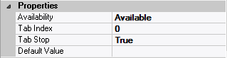
| Attribute Name | Default Value | Description |
| Availability | Available | The way in which the end-user will interact with this form field: Available → This form field can receive input focus and its contents can be modified; Unavailable → This form field cannot receive input focus and its contents cannot be modified; Guarded → This form field can receive input focus but its contents cannot be modified; Protected → This form field cannot receive input focus, its contents cannot be modified and it will appear grayed-out; |
| Tab Index | 0 | The relative position of this form field in the tab sequence order for its parent container or form field; 0 → The relative position of the form field in the structure chart will be used instead. |
| Tab Stop | True | True → This form field will be included in the tab order for its parent container or form; False → |
| Z-Order | >= 10001 | The relative depth of this form field in relation to other form fields within the same parent container or form. |


 English
  Portuguese