
How Can We Help?
The Label
Main Characteristics of Labels
A label form field is the only form field object that is not addressable from the Zim language. Labels contain constant text only and are used for adding explanatory text to the form being designed. Label text can span multiple lines (and can include the “Hard Return” character Ctrl+Enter). The label text can also be justified left, centered, or right. To create a multi-line label form field, adjust its vertical size.
Label Attributes
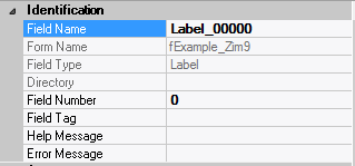
– Identification
| Attribute Name | Default Value | Description |
| Field Type | – | The type of this form field or of this user interface object. (Read-only). |
| Field Name | variable | A string that identifies this form field within the Zim application; Automatically assigned by the Zim IDE when a new form field is created; May be changed by the developer, but must always conform to the Zim Object Naming Rules and satisfy the Zim Object Uniqueness Conditions. |
| Directory | ZIM | The directory that owns the parent form of this form field (Read-only). |
| Form Name | – | A string that identifies the parent form of this form field (Read-only). |
– Appearance
| Attribute Name | Default Value | Description |
| Fill Character | ” “ | The character used to fill blank spaces in this form field. |
| Label | ??? | The label text which appears inside or along the top border of the form field; A character in the label will be underlined if there is an ampersand (&) immediately before it. |
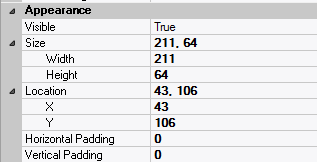
| Location | – | The location (in pixels) of this form field in relation to the top-left corner of its parent form or parent container. |
| X | – | The horizontal location of this form field. |
| Y | – | The vertical location of this form field. |
| Reverse Video | False | True → The text will appear in white on a black background; False → The text will appear in black on a white background; |
| Size | – | The size of this form field in pixels. |
| Width | – | The width of this form field. |
| Height | – | The height of this form field. |
| Visible | True | True → This form field will be visible by default. |
– Behavior
| Attribute Name | Default Value | Description |
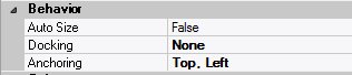
| Anchoring | Top, Left | When the window associated with this form field’s parent form is resized: Top → The top edge of this form field will maintain its distance from the top edge of the window; Bottom → The bottom edge of this form field will maintain its distance from the bottom edge of the window; Left → The left edge of this form field will maintain its distance from the left edge of the window; Right → The right edge of this form field will maintain its distance from the right edge of the window; None → The same as Top, Left. |
| Auto Size | None-Clipped | None-Clipped → The image in this form field object will be displayed in its original size anchored at the top-left corner of the object. If the image is wider or taller than the object, it will be clipped horizontally or vertically to fit within the object; Image to Object → The image will occupy the entire area of the object but its aspect ratio will not be preserved; Image Proportional → The image will be scaled and centered within the object and its aspect ratio will be preserved; Object to Image → The object will be scaled to fit the image in its original size. The object cannot be resized. |
| Docking | None | Top → The top edge of the form field will be expanded and placed; Bottom → ; Left → ; Right → ; Fill → ; None → This form field. |
– Colors
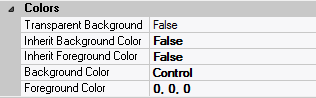
| Attribute Name | Default Value | Description |
| Background Color | variable | The background color of the form field, container or user interface object in R(ed) G(reen) B(lue) values; |
| Foreground Color | variable | The foreground color of the form field, container or user interface object in R(ed) G(reen) B(lue) values. |
| Inherit Background Color | variable | True → The form field or container will inherit the background color of its parent container or parent form object. |
| Inherit Foreground Color | variable | True → The form field or container will inherit the foreground color of its parent container or parent form object. |
– Properties
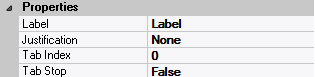
| Attribute Name | Default Value | Description |
| Justification | None | The justification applied to the contents of this form field: Left or None → the contents will be displayed left-aligned; Right → the contents will be displayed right-aligned; Center → the contents will be displayed centered. |
| Tab Index | 0 | The relative position of this form field in the tab sequence order for its parent container or form field; 0 → The relative position of the form field in the structure chart will be used instead. |
| Z-Order | >= 10001 | The relative depth of this form field in relation to other form fields within the same parent container or form. |
– Style
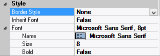
| Attribute Name | Default Value | Description |
| Border Style | variable | None; Single Line; 3D; Beveled-In; Beveled-Out |
| Font | Microsoft Sans Serif, 8pt | The font in which text will be displayed inside this form field. |
| Name | Microsoft Sans Serif | The system name of the selected font. |
| Size | 8 | The size of the font in units. (Point is the default unit); |
| Bold | False | True → The text inside this form field will appear in bold. |
| Italic | False | True → The text inside this form field will appear in italic. |
| Strikeout | False | True → The text inside this form field will appear with a line across. |
| Underline | False | True → The text inside this form field will appear underlined. |
| Inherit Font | False | True → This form field will inherit all the Font attributes from its parent (form, frame or tab control). |
 English
  Portuguese