Zim IDE Components
Documentation | Blog | Demos | Support
Zim IDE Components
The Organization of Zim IDE
Zim IDE consists of eight separate visual components distributed within five different panels. Some panels are occupied by two different visual components, of which only one is displayed individually when selected by the designer.
The visual components of Zim IDE and their respective display panels are introduced below:
| Component | Display Area |
| Menu Tool Bar | Menu Area |
| Database Tab Page | Left Panel |
| Tool Box Tab Page | Left Panel |
| GUI Designer | Central Panel |
| Document Editor | Central Panel |
| Properties Tab Page | Right Panel |
| Tree View Tab Page | Right Panel |
| The Field View Panel | Field View Panel |
The following images show how the different areas of the Zim IDE fit together during the user interface design process:
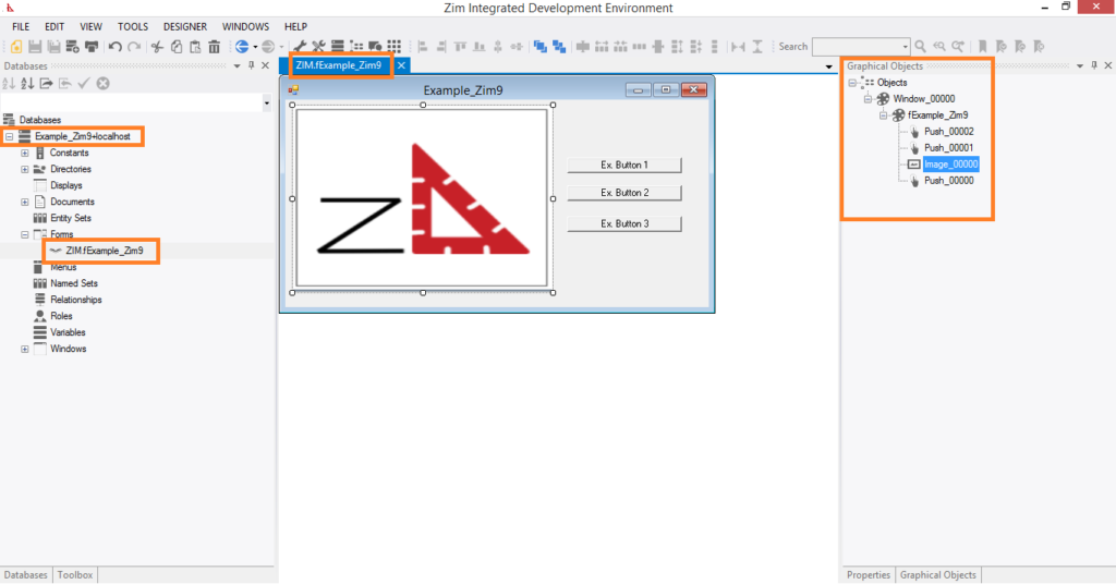
Example 1: Connected databases and the structure of objects
In this image, the form fExample_Zim9 is being edited in the GUI Designer workspace, while the database Example_Zim9 + localhost are connected to this Zim IDE session as shown in the database tab page. the form opened in the GUI designer (fExample_Zim9) are shown in the Tree View Tab Page on the right, along with their respective fields.
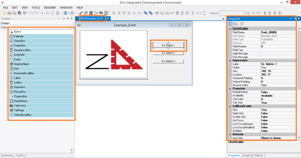
Example 2: Form field attributes and objects available in the Tool Box tab page
In this image, the form fExample_Zim9 is being edited in the GUI Designer workspace. A Push Button is currently selected and its attributes are shown in the Attributes Tab Page. The Tool Box Tab Page is also visible, showing the available user interface objects that can be added to the form.
 Portuguese
  English